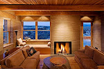
http://www.billschwab.com/webseries/special_offer/november_2010_offer.html
Friday, November 12, 2010
Bill Schwab print offer.....
http://www.billschwab.com/webseries/special_offer/november_2010_offer.html
Tuesday, November 9, 2010
Why Are My Prints Too Dark?
If you print digitally and struggle to get accurate soft-proofing (who doesn't struggle with this?)........this article from LuLa by Andrew Rodney is absolutely fundamental.
Why Are My Prints Too Dark?
Why Are My Prints Too Dark?
AIA Albuquerque Competition
Wow! This year I worked on eight of the fourteen winners entries of the AIA Albuquerque Design Awards. It was very competitive this year with 56 strong entries. Congratulations to all these very talented designers!
Honor Awards
Honor Awards
Casa Guadalupe Franciscan Friary
Architect: Calott + Gifford Architecture / Urban Design
Owner: Province of Our Lady of Guadalupe Franciscan Friars
Contractor: Enterprise Builders
Architect: Calott + Gifford Architecture / Urban Design
Owner: Province of Our Lady of Guadalupe Franciscan Friars
Contractor: Enterprise Builders
Valle Vista Elementary School
Architect: Garrett Smith, Ltd.
Owner: Albuquerque Public Schools
Contractor: Cheyenne Builders
Architect: Garrett Smith, Ltd.
Owner: Albuquerque Public Schools
Contractor: Cheyenne Builders
Merit Awards
University of New Mexico Cancer Research & Treatment Center II
Architect: Rohde May Keller McNamara Architecture, P.C. & VOA Associates Inc.
Owner: University of New Mexico
Contractor: Flintco Inc. General Contractors
Architect: Rohde May Keller McNamara Architecture, P.C. & VOA Associates Inc.
Owner: University of New Mexico
Contractor: Flintco Inc. General Contractors
Citation Awards
Aperture Center
Architect: Jon Anderson Architecture (Executive)
and Antoine Predock Architect PC (Design)
Owner: Forest City Covington
Contractor: Klinger Constructors, LLC
nex+Gen Academy
Architect: Dekker/Perich/Sabatini
Owner: Albuquerque Public Schools
Contractor: AIC General Contractor
Sage House
Architect: Jon Anderson Architecture (Executive)
and Antoine Predock Architect PC (Design)
Owner: Mike and Vee Yacinno
Contractor: Ian Forsberg - General Contractor
Placita House
Architect: Jon Anderson Architecture
Owner: Juno and Julia Raby
Contractor: Sunbelt Properties - General Contractor
Downtown@700 2nd
Architect: Dekker/Perich/Sabatini
in collaboration with Garrett Smith, Ltd.
Owner: Supportive Housing Coalition of New Mexico
Contractor: Global Structures
Architect: Jon Anderson Architecture
Owner: Juno and Julia Raby
Contractor: Sunbelt Properties - General Contractor
Downtown@700 2nd
Architect: Dekker/Perich/Sabatini
in collaboration with Garrett Smith, Ltd.
Owner: Supportive Housing Coalition of New Mexico
Contractor: Global Structures
Friday, November 5, 2010
Digital Tools for Architectural Photographers
Interesting article by Richard Sexton in LuLa. Richard is a widely published architectural photographer working out of the South. The article is on the tools of the trade. Note the conclusions.
DIGITAL TOOLS FOR ARCHITECTURAL PHOTOGRAPHERS
DIGITAL TOOLS FOR ARCHITECTURAL PHOTOGRAPHERS
Thursday, November 4, 2010
Cropping Architectural Images for Clients
Thanks for the inquirey-good question. First off to maximize image quality, I try to shoot full frame in the field. When I do crop it is to improve image impact and I don't worry really about maintaining the native Aspect Ratio of the camera. So when I deliver a set of files the majority are in the native AR and a few are whatever. Those that are not are mostly stitches of some sort. Clients have never said boo about it. The only time I get a request for a specific AS is with magazine covers or from architects who have existing framed prints in their office that they want to match, but that has been rare."Hello Kirk, I have been reading your site and learning for quite a while. Your eye for images is stunning. I have a question about cropping. I stay within the camera original aspect ratio when I deliver images for clients, unless they provide specifics. I have a start up photography business and I do residential and commercial. I hope to eventually shoot major architectural jobs (I have a longggggg way to go) and am learning all I can. Presently, I'm using a crop sensor Canon DSLR with good results for the clients I have served. I am going full frame with a Canon 5D II set-up in December. What ratio due you normally crop to (hopefully I'm asking the right question here)? Do you stay within your cameras native ratio or do you crop to desired look. I have had several images that I feel would be improved with "free" cropping (no set aspect ratio, just drag box until I get desired effect). Any cropping advice would be appreciated. Much info on cropping, but not much on the delivery side. Keep up the good work"
The only time cropping to a specific AR becomes absolutely critical for me is when I am shooting assigned magazine covers. There has to be room made for the masthead, leads etc. Since all magazines are not the same AS it requires some legwork to figure that out ahead of time. For some of my clients like Su Casa (and), which I have mentioned before here, we always shoot tethered, bring the potential cover up in PS and layer it with the magazines cover template to make sure everything fits. We have learned to do this because of AR issues in the past.
Sunday, October 10, 2010
Fond memories of former assistants......
Fond memories of former assistants.......a couple of days ago I received this message from a young man who worked for me briefly some years ago.....really sweet.
It really makes me happy to hear comments like this. To have a positive impact on someone's life makes all the other successes seem somewhat trivial.
Hello Kirk, Recently I have been thinking of how I got to where I am at today and a key part of my life was working for you. At that time I was heading in the direction of so many high school dropouts, but working for you gave me a sense of purpose and enjoyment and really was a spring board in getting my first big city photo gig. Just overall a very positive experience.
So thank you for that opportunity and congratulations on being a grandpa and all the other good stuff going on with you
It really makes me happy to hear comments like this. To have a positive impact on someone's life makes all the other successes seem somewhat trivial.
Sunday, October 3, 2010
Composing Architectural Images
In the last thread Tonnes asked:
This is a detail of a rail in front, against a structural crossbeam, against the window frames with a sage covered hill in the background.
In a couple of days I will post this images predecessor which I carefully framed, exposed and then packed up the camera to move on to the next area. But I couldn't walk away from the scene-it felt unfinished-until I did the image above. See you soon!
By the way Kirk, your image is beautifully composed. It would be great to hear more from you on the subject of composition.Thanks for that comment Tonnes. I have to say that I have always had difficulty discussing composition. To me there are no rules. It is almost "when it feels right-its right". I know how lame that sounds to allot of people and it is not an intentional cop-out, but that is how I work. Here is an example from that same Reno shoot-one of my favorite detail shots of all time.
This is a detail of a rail in front, against a structural crossbeam, against the window frames with a sage covered hill in the background.
In a couple of days I will post this images predecessor which I carefully framed, exposed and then packed up the camera to move on to the next area. But I couldn't walk away from the scene-it felt unfinished-until I did the image above. See you soon!
Tuesday, September 28, 2010
A decent HDR program finally?
Architecture is the crucible of HDR programs. The hard edges between light and dark areas generate halos etc. Up to this point I ALMOST ALWAYS found it better to light the site artificially rather than try and make an HDR image look decent. Don't think I didn't try. I own or have tried most if not all the HDR programs out there and largely given up in frustration.
Then came Lightroom 3 and the Enfuse Plugin. I have much testing to do, but my initial tests show great potential. The test below (bottom) is the DEFAULT settings from a 2 stop exposure bracket, straight from the DNGs in LR3. The image on the top is the unaltered "middle" exposure. Hmmmm........
Architecture by Dekker Perich Sabatini-Albuquerque, Las Vegas and Amarillo. The University of Nevada Reno Center for Molecular Medicine in Reno Nevada.
Now you might say that this could be done by boosting the Recovery and Fill Light sliders and.......yes you could and I did, but you concurrently generate pattern noise in the shadows you boost. Enfuse's method of sampling the shadows from the brightest exposure creates bright shadows with zero noise (this is typical of all the HDR programs I have tested).
This HDR'd result tries to more closely mimic the eyes experience of the scene where the eye dilates as it moves from shadowed areas to the windows. If you overdue it, bringing the window light down further, the lack of brightness in the windows seems unnatural resulting in that overdone HDR effect.
Sunday, September 19, 2010
Have you been waiting for the Canon upgrades to the 90 and 45 T/S lenses? Lenses on par with the new 24T/S II and 17? Schneider jumps in with some mighty contenders!
Schneider T/S
According to recent reports from Photokina, these lenses have manual apertures, which at this price point is a real drag.
Schneider T/S
According to recent reports from Photokina, these lenses have manual apertures, which at this price point is a real drag.
Saturday, September 18, 2010
Scanning for Fine Art Images
Imacon "Virtual Drum Scan" vs. Epson 750 home scan vs. Aztec Premium Drum Scan
Frankly most of my serious efforts with scanners and scans revolve around my B&W work. Of course I have, prior to digital, had thousands of my commercial color transparencies scanned for magazines, books, posters etc. but I was rarely involved in that. For a couple of years, just prior to digital, I did do allot of my own scanning for commercial publication because I was behind the times and everyone just wanted files. I never found that a home scanner like an Epson 750 (in my hands) could deliver what a commercial drum scan could deliver on transparencies for publication. They suffered in the shadow areas, highlight separation, color fidelity etc. I never had any complaints from clients, but I could see the difference.
It is certainly true IME that the major differences of home flatbeds and pro drum scans lies in resolution and in the renderings of the extremes of the tonal range. My 750 cannot pull detail out of deep shadows anywhere close to a good drum scan and I believe at the other end of the scale in the highlights that there is some flaring that takes place in home flatbeds that obscures fine detail in dense highlights.
I believe this is part of the key to maximizing tonal control from the Epson scanners. Shoot and develop for the limitations of the scanner. With a drum scan I just shoot normally using basic Zone System controls, but to maximize a scan on an Epson I would place the low values higher and develop the highlights lower.
BTW, I visited the printing service (Pat Carr-Carr Imaging-a true master) I use for large digital prints yesterday, who was working on a print of mine that I had never printed in silver or ink larger than 16x20 before (4x5 TRI-X in HC-110). I have never owned a printer that would print over 17" wide. This is a print 24x33-actually the largest art print I have ever made and is for an upcoming museum show. It was scanned by me on a well maintained Imacon at SAIC and looked superb at that size. The grain (or grain clumping I don't suppose that an Imacon can actually resolve grain) was sharp and tight and looked great even on close inspection with my reading glasses, requiring no additional sharpening than the original Imacon capture sharpening (I don't remember the setting). This was never a "look" that I could get on large prints with my Epson. As a backup I had Lenny Eiger, Eiger Studios, do a drum scan of the same image in case it didn't hold up at that size. Lenny's scan pulled more deep shadow detail out of the negative, but I didn't need it-not a wasted expense anyway-I am archiving quality drum scans of all my best images from the past 30 years.
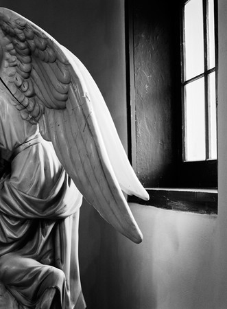
I know Lenny's drum scan has more deep shadow detail than the Imacon, but I tend to print this pretty deep anyway. There is a fair amount of work in the file and with a tight deadline looming, I was not wanting to start over with a new scan unless I had to. But in terms of resolution the Imacon could handle this size and on this image the tones were fine too.
Frankly most of my serious efforts with scanners and scans revolve around my B&W work. Of course I have, prior to digital, had thousands of my commercial color transparencies scanned for magazines, books, posters etc. but I was rarely involved in that. For a couple of years, just prior to digital, I did do allot of my own scanning for commercial publication because I was behind the times and everyone just wanted files. I never found that a home scanner like an Epson 750 (in my hands) could deliver what a commercial drum scan could deliver on transparencies for publication. They suffered in the shadow areas, highlight separation, color fidelity etc. I never had any complaints from clients, but I could see the difference.
It is certainly true IME that the major differences of home flatbeds and pro drum scans lies in resolution and in the renderings of the extremes of the tonal range. My 750 cannot pull detail out of deep shadows anywhere close to a good drum scan and I believe at the other end of the scale in the highlights that there is some flaring that takes place in home flatbeds that obscures fine detail in dense highlights.
Quote:
| And if you take that into account when exposing and developing your film, you should be able to get as much shadow detail as you'd like in your images, even using an Epson scan. Peter De Smidt |
BTW, I visited the printing service (Pat Carr-Carr Imaging-a true master) I use for large digital prints yesterday, who was working on a print of mine that I had never printed in silver or ink larger than 16x20 before (4x5 TRI-X in HC-110). I have never owned a printer that would print over 17" wide. This is a print 24x33-actually the largest art print I have ever made and is for an upcoming museum show. It was scanned by me on a well maintained Imacon at SAIC and looked superb at that size. The grain (or grain clumping I don't suppose that an Imacon can actually resolve grain) was sharp and tight and looked great even on close inspection with my reading glasses, requiring no additional sharpening than the original Imacon capture sharpening (I don't remember the setting). This was never a "look" that I could get on large prints with my Epson. As a backup I had Lenny Eiger, Eiger Studios, do a drum scan of the same image in case it didn't hold up at that size. Lenny's scan pulled more deep shadow detail out of the negative, but I didn't need it-not a wasted expense anyway-I am archiving quality drum scans of all my best images from the past 30 years.

I know Lenny's drum scan has more deep shadow detail than the Imacon, but I tend to print this pretty deep anyway. There is a fair amount of work in the file and with a tight deadline looming, I was not wanting to start over with a new scan unless I had to. But in terms of resolution the Imacon could handle this size and on this image the tones were fine too.
Friday, September 3, 2010
The Dwell Effect
I have been discussing, off and on, the impact on our business of the popular magazine Dwell. It is not an abstract discussion as myself and many photographers I know have been asked to imitate that "Dwell Look". Well here is my latest, an art directed example for one of my favorite locally based national magazines.
The original a flat stitch of one of the reject poses with the camera in a horizontal position. The stitch was requested to insure that they had enough real estate to work from. There was great natural light that just needed to be slightly boosted and the ambient color to be cleaned up. Two lights were used, a fill bounced off the white wall behind me and one in the kitchen set slightly brighter to pull the eye in. When doing these kind of stitches, it is only necessary to shoot the left side once, but the right side with the home owner multiple times, in different poses, and then stitch the selected right side of the woman with the previously shot left side. This was a difficult stitch as there was not much detail in the overlap area for the program, PS CS4 to find reference points. I ended up manually stitching these. The right example has been cropped in some already at this point. The merge area is between the chairs.
Unfortunately I had to manually stitch a number of these before the art director decided which she wanted. Left-the final published cover. Right-one of the rejected poses.
The most recent cover in the same vein.
Thursday, August 26, 2010
Saturday, August 21, 2010
Monday, August 9, 2010
Ed Ranney's "New World Landscapes" at the Denver Art Museum
There's allot to see right now in Denver, Henry Moore's superb sculptures at the Denver Botanical Garden, King Tut at the Denver Art Museum........all magic.
But my favorite was the Ed Ranney, large format b&w photography, show at the Denver Art Museum. Traditional silver prints from 5x7 negatives, Ed's pristine images of archeological sites in Latin America was the highlight of my trip. Archeology sites are near and dear to my own aesthetic, partly because of the inspiration that Ed has given me for some 30 plus years.
But my favorite was the Ed Ranney, large format b&w photography, show at the Denver Art Museum. Traditional silver prints from 5x7 negatives, Ed's pristine images of archeological sites in Latin America was the highlight of my trip. Archeology sites are near and dear to my own aesthetic, partly because of the inspiration that Ed has given me for some 30 plus years.
Tuesday, August 3, 2010
Simply for the love of Architecture-Gehry in Las Vegas
Monday, August 2, 2010
Sinar creates adapter to mount DSLRs as digital backs
Sinar p-slr review
It maybe useful for some studio applications, but IMO for architecture it takes a very versatile tool (a full frame DSLR with T/S lenses) and turns it into an expensive boat anchor. Cambo and Arca have similar offerings. Sinar
To quote Christopher Barrett, a leading architectural photographer: "These are cool and all, I have one for my Arca, but they have a lot of limitations, namely the use of wide lenses. Maybe you could use wide Medium Format lenses, since they have a retrofocus design, but if you are going to use a view camera, why settle for lenses that are not quite as sharp as Rodenstock and Schneider's just so you can put a dslr on?"
Saturday, July 10, 2010
Tuesday, July 6, 2010
Student show
Thursday, July 1, 2010
A visit from a master........
Richard Wasserman graciously came to my architectural photography class at SAIC yesterday to share his fine work. He showed original prints of two outstanding bodies of work, his Chicago River and Bensenville series. Richard is one of those guys I consider the "salt of the medium" doing fine work on their own because you are simply driven to by the subject matter.
Thanks so much Richard. It was a treat for the me and the students. Best of luck with the upcoming book of the Chicago River images and accompanying exhibit at the Harold Washington Library.
http://richardwasserman.net/
__________________Thanks so much Richard. It was a treat for the me and the students. Best of luck with the upcoming book of the Chicago River images and accompanying exhibit at the Harold Washington Library.
http://richardwasserman.net/
Thanks,
Kirk
Sunday, June 27, 2010
Shooting Tethered
There are many programs available for shooting tethered to a computer. Working up to an interior lighting demo for my students, I revisited Canon's EOS Utility/DPP and Lightroom 3 (the old Watch or "Hot Folder" method), a couple of software programs that support tethering. In the past I had not been impressed with earlier versions of either program for tethering. Both were flaky IME. For clients on a shoot that required a larger viewing experience, I used to resort to using a card reader or spend half my time fiddling with the computer link, embarrassing and stressful. LR3 now has a specific tethering feature that works with most recent major Canon and Nikon cameras (for supported cameras see. Nikon also has free software that comes with their cameras but I am not familiar with it.
Both programs seem much more stable now. Cannon EOS Utility/DPP supports full camera exposure control (plus ISO etc.) from the computer, while LR3 supports shutter firing and exposure info display only. Neither will work firing from the computer if you shoot with the Mirror Lockup on. I only shoot with the Mirror Lockup on, to minimize vibrations, so firing from the computer is not important to me. Why mirror locked up? Not to sound like a broken record, but to do truly professional quality work with a DSLR you have to make every possible effort available to maximize image quality. However both these programs seem less than happy when you shoot with MLU on, especially if you et the camera go to sleep and then try and wake it up by firing a shot. If this is an issue go back to regular firing.
In any event of the two I found LR3 to be the program that best fit my skills and workflow. I have never gotten comfortable with DPP. As I always shoot RAW and use Adobe Camera RAW in Photoshop to process the files, it is a short leap for me to the RAW processor in LR3, which though it has a slightly different interface than ACR is basically the same program. In the spirit of KISS (keep it simple stupid), a nod to my aging brain, the Canon 5d MKII>LR3>Photoshop workflow keeps things streamlined. Now of course LR3 is not free like the Canon DPP software suite is (DPP comes with the Canon camera and you can't download DPP from their website unless you have the original disks). Lightroom approaches $300, which may be a consideration for many.
Only the DPP suite supports tethered Live View. LR3 will not-again not very important to me.
One annoying thing. If you have the DPP suite loaded on your computer, even if you also have LR3 loaded and running, DPP seems always to be the default program to open up when you make an image while synced. if you work continually it only comes up the first time, but if you take a break and let the camera go to sleep and come back and try to fire the camera, the EOS Utility want to open up again. There seems to be no way around this unless you uninstall the EOSU/DPP suite. Anyone have any ideas on this? For teaching purposes I want to keep both on my laptop and for the odd time I want to shoot tethered in Live View. See the discussion below with Jim Hunter for a fix he found for this for both Mac and PC. See also Mac Fix.
Tuesday, June 22, 2010
Louis Sullivan through the eyes of Nickel, Szarkowski and Siskind
"Looking after Louis Sullivan: Photographs, Drawings and Fragments".
One of the best architectural photography exhibits I have ever seen is this newly opened Sullivan exhibit at the Art Institute of Chicago. Featuring images of Sullivan's designs by Aaron Siskind, John Szarkowski and Richard Nickel, this exhibit features many widely known and lesser known masterpieces of modern architectural photography. The exhibit also displays Sullivan's masterful drawings and many ornamental details salvaged from buildings. The museum did nothing in 2006 for the Sullivan 150 year anniversary, so this is 3 years late and low key-but superb. See it if you possibly can.
Looking After Louis Sullivan.....
Sullivan Exhibit
Vanishing Point Clone Tool in PS
This has been around since CS2, but I didn't discover it till CS4. Doh! I could have been using it for years. Going one step further from the cloning I taught in class the other day, lets look at "Vanishing Point Cloning". This, IMHO, is one of the most useful tools for architectural photographers in all of PhotoShop, because it allows one to perform corrections while maintaining perspective. From removing stains appropriately in carpets to fixing brick work, this tool has a myriad of uses. I went years before I discovered this procedure, and then it was one of these "Holy Crap" moments. Why didn't I discover this years ago! Imagine how many ways you can use this. The basic filter/tool is used this way:
Vanishing Point Clone Tool Video and More Vanishing Point Cloning
and a more involved and a bit over the top tutuorial for the Vanishing Point filter. There are some techniques to learn here that can be used in more believable and appropriate ways for traditional architectural photography. For instance I have used the wheels example similarly for replacing light fixtures that were not working. The exercise with the grass, I have used many times to fix bad areas in a lawn or pavement. Yes, IMHO, perspective in size of grass blades in a lawn or the granularity of pavement is important to pay attention to:
Vanishing Point: Photoshop Tutorial Video
Enjoy!
Thursday, June 10, 2010
AP Photo Class-Examples from the First Assignment.
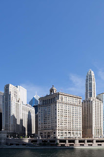
From classic documentation to elegant details, a few examples of the outstanding images by the students from the first assignment, photographing the Loop.
Above, fireworks exploding from the fog over the Lake Michigan by Marc Falzon.
Above, a detail of the Aqua and adjacent building by Mona Luan.
Above, the facade of the Merle Reskin theater by Susanah Ribstein.

Above, the Tribune building entry by Mona Luan.
Above, the Aqua Building by Alli Gentles.
Above, fireworks exploding from the fog over the Lake Michigan by Marc Falzon.
Above, a detail of the Aqua and adjacent building by Mona Luan.
Above, the facade of the Merle Reskin theater by Susanah Ribstein.

Above, the Tribune building entry by Mona Luan.
Above, the Aqua Building by Alli Gentles.
Tuesday, June 8, 2010
AP Photo Class-Raw processing in Adobe Camera Raw
This is a pretty good quicky overview of the most basic aspects of camera raw:
Camera Raw
Camera Raw
Saturday, June 5, 2010
AP Photo Class-30D/40D Manual Exposure
Have fun with this! Do the best you can. The weather sucks so be creative! Don't drop your lens! Ha Ha.
Frankly there is not much out there that is simple or brief for the 30D. Here are the relevant pages from the official Canon 30D manual:
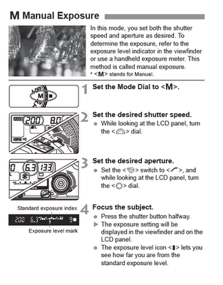
The whole manual in PDF form can be accessed here 30D Manual.
For the 40D there is a video here 40D Video.
The manual is here 40D Manual.
and the relevant page is:
Again, have fun with this! Do the best you can. The weather sucks so be creative!
Frankly there is not much out there that is simple or brief for the 30D. Here are the relevant pages from the official Canon 30D manual:

The whole manual in PDF form can be accessed here 30D Manual.
For the 40D there is a video here 40D Video.
The manual is here 40D Manual.
and the relevant page is:
Again, have fun with this! Do the best you can. The weather sucks so be creative!
Thursday, June 3, 2010
"Thoughts on Perspective Correction" AP Class Notes
I am a big believer in using Tilt Shift lenses to correct perspective with DSLRs, but newbie's may not have the resources for these expensive lenses. As I have said, ad-nauseum, to do professional level AP work with a DSLR you have to carefully structure your work flow to maximize file quality at every step. Doing perspective correction in Photoshop eats quite a few pixels and introduces a fair amount of computer interpolation in the stretched areas. These kinds of practices lead to image degradation, but for end products like websites, this quality may be acceptable.
EXAMPLES
Leveled camera=too much foreground.
Unless you compose for it.
Point the camera up to get rid of the foreground and you get massive perspective convergence.
Do a simple PC in Photoshop and you get what I call truncating of the forms-they come out way to squat and you lose allot of the left and right edges. More PS work ensues to correct the squat!
Whereas correcting perspective with a Tilt Shift lens preserves the proportions and the edge framing.
There are many ways to correct perspective. Even with T/S lenses you may not have enough rise and still need to point the camera up slightly. I prefer the one below because the correction is rarely symmetrical (instead of the more common method see this Simple Method which is worthless unless you had truly leveled the camera before pointing it up and had symmetrical perspective problems. With this next method you correct each side separately. Prefered Method of PC. Remember sometimes a very slight convergence looks more natural than a fully corrected perspective on very tall buildings.
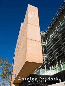
But sometimes....sometimes the best thing to do is just make the composition work with a ton of convergence. Example-My recent image on the cover of Antoine Predock's new Rizzoli monograph (number 5) =The University of New Mexico School of Architecture.
AP Class at SAIC (2)
The class is full with enthusiastic students. We have some exciting projects in the cue. It looks like it will be a great class. More to come.
Tuesday, May 25, 2010
Ahhh....Chicago
Tomorrow morning early.......the big pilgrimage to Chicago to teach my AP class at SAIC. Chicago has the best collection of architecture in the country.
Saturday, May 15, 2010
Progressive Stretch-Extreme Perspective Correction Issues & Techniques
Luminous Landscape
Interesting thread started by Marc Gerritsen, a top notch pro in the far east, about what you do when you approach the limits of your movements and start getting weird artifacts and scaling distortion in your AP images.
Interesting thread started by Marc Gerritsen, a top notch pro in the far east, about what you do when you approach the limits of your movements and start getting weird artifacts and scaling distortion in your AP images.
Monday, May 10, 2010
Christopher Barrett's Talk at ProGear in Chicago
Top AP pro Christopher Barrett is giving a seminar at ProGear in Chicago and talking about Arca cameras, Phase One backs and Profoto strobes. I hope to see some of you all there. That is on June 7 starting at 5:00 at:
ProGear
Address:
1740 W. Carroll Avenue
Chicago, IL 60612
Telephone 312-376-3770
ProGear
Address:
1740 W. Carroll Avenue
Chicago, IL 60612
Telephone 312-376-3770
Wednesday, May 5, 2010
Adobe® Lens Profile Creator
Adobe® Lens Profile Creator
This tool for Photoshop CS5 may be useful for creating lens correction profiles for T/S lenses at varying degrees of shift. I'm not sure about this yet but I will be testing this idea over the next few months. If anyone else tries this method, let me know your thoughts.
See this other thread here: New CS5 Lens Correction Tool
And watch this thread on Luminous Landscape.
Monday, May 3, 2010
AP Class at SAIC
I got the word-my class in June at The School of the Art Institute of Chicago filled up. Its a go-you never know in this economy! I'll be in Chicago from June 1st-July10th staying in the visiting artist condos on Michigan Ave. Teaching is very stimulating for me. We will visit Hedrich-Blessing as always (like a pilgrimage to Mecca for an AP). I should come up with allot of new thoughts on AP for posts here.
Thursday, April 29, 2010
Thoughts on diffraction.....
What is it? Basically in architectural photography we use small apertures for maximum depth of field. But if you stop down to an aperture smaller than optimum a problem referred to as diffraction crops up to compromise the overall sharpness of the film/file. It is easy to see this effect with a DSLR by doing a series of equivalent exposures of say a textured wall-stopping down the lens a full stop each time while slowing down the shutter speed a full stop each time to give an equivalent exposure. At a given smaller aperture the sharpness will ever so slightly start to decline-usually with DSLR lenses around f11-and get progressively worse as you stop down further. What does this mean with architecture? Usually I want maximum depth of field (depth of focus) so I am always stopping down. But at what point does diffraction become objectionable? By my tests (for example with a 24 T/S II) diffraction starts to hint at an aperture smaller than f11. Remember a smaller aperture is a larger number right? F8 is a larger aperture than f22. But back to my 24mm test, f11 does not give me enough depth of field most of the time especially if I have a close foreground and a building in the background filling the frame (a near/far composition which amounts to allot of my shots). My compromise? F13 (unless I know the images are going to only be used small I may go to f16 or even f22 rarely). Note a touch more sharpening can hide a touch of diffraction. This from the LargeFormat Forum may help explain this:
On digital cameras it is a little more complex, because you have to factor in weird things like pixel pitch. If you are a techy read this. If you do their calculations on my lens/camera example above, you see that at f11 I am not diffraction limited but at f13 it is just starting-which confirms my field tests. Otherwise if you are just a shooter like me just do the simple testing I suggested and pick your optimum aperture for the lenses and scenes you like to photograph. Remember my POV. To make a DSLR do first class professional AP. You must maximize at every step the quality of the image. In this case that means getting the smallest aperture possible without inducing too much diffraction.
Ian raised an interesting point:
Excellent point Ian. It raises the issue of tilts which can effectively give an image an exaggerated DoF. Frankly I don't use much tilt on architecture (I use it allot on landscape), because I work fast and tilts can get you into allot of trouble. Basically tilts change the plane of focus from parallel to the wall or building to a plane slanted (if you tilt forward) from the foreground to the top of the background. This leaves the bottom of buildings potentially waaaaaay out of focus and your DoF may not pull it back into focus. So use tilt verrry sparingly like no more than 1/8 to 3/16 of an inch forward tilt and refocus on the foreground a bit away from camera position and the building a bit below the top and look CLOSELY at the bottom of the building and see if it is way to far out of focus-use your Live View focusing magnifier to take a good look and see if you are in the ballpark. You may need more or less tilt. Remember to keep the building straight-you still keep the camera level as you tilt the lens forward. I strongly suggest practicing this some and looking at the files blown up on your monitor to really see what is OK in terms of tilt and aperture and DoF.
DIFFRACTION
A beam of light passing through a circular aperture spreads out a little, a phenomenon known as diffraction. Diffraction is a physical phenomena which is inescapable. The smaller the aperture, the more the spreading. For photographic lenses, diffraction depends only on the f-number. Strictly speaking, diffraction is a function of aperture size or the physical size of the hole and that is how it would be defined in a physics textbook. Which means that the larger area aperture in a 300mm lens at f/16 (as compared to a 50mm lens at f/16) should provide lower diffraction. However, diffraction patterns are angular patterns and as such are dependent on how far from the aperture you place the screen used to view it also. In photography, the aperture is at the optical center of the lens and the screen is (for infinity focus) one focal length away. The physical size of the diffraction blur is then the focal length divided by the apparent size of the aperture i.e., the definition of the f stop. Thus, in photography, diffraction is only a function of f stop and not a function of the focal length. In simpler terms, the larger aperture of the 300mm lens does offer lesser diffraction at the diaphragm (i.e., less bending around the diaphragm) but since the light now has a longer distance to travel (as compared to the 50mm lens), the smaller bending still results in a fair bit of blur at the viewing screen. N Dhananjay
On digital cameras it is a little more complex, because you have to factor in weird things like pixel pitch. If you are a techy read this. If you do their calculations on my lens/camera example above, you see that at f11 I am not diffraction limited but at f13 it is just starting-which confirms my field tests. Otherwise if you are just a shooter like me just do the simple testing I suggested and pick your optimum aperture for the lenses and scenes you like to photograph. Remember my POV. To make a DSLR do first class professional AP. You must maximize at every step the quality of the image. In this case that means getting the smallest aperture possible without inducing too much diffraction.
Ian raised an interesting point:
Hi Kirk. Firstly, thanks for taking the time to write this blog. I appreciate the effort in communicating your insights, techniques and link sharing. In response to this post, is there a possible part 2 in which you share how using a t/s, angled down 8 degrees, helps give the illusion of greater depth of field? I'm guessing on the degrees, as I do not as yet own a t/s. Could a statement be made such as, 'if you're stuck at f/13 due to diffraction but angle your t/s by this amount, it'll look like you're at f/22' or some such thing?
Thank you sir,
Ian.
Excellent point Ian. It raises the issue of tilts which can effectively give an image an exaggerated DoF. Frankly I don't use much tilt on architecture (I use it allot on landscape), because I work fast and tilts can get you into allot of trouble. Basically tilts change the plane of focus from parallel to the wall or building to a plane slanted (if you tilt forward) from the foreground to the top of the background. This leaves the bottom of buildings potentially waaaaaay out of focus and your DoF may not pull it back into focus. So use tilt verrry sparingly like no more than 1/8 to 3/16 of an inch forward tilt and refocus on the foreground a bit away from camera position and the building a bit below the top and look CLOSELY at the bottom of the building and see if it is way to far out of focus-use your Live View focusing magnifier to take a good look and see if you are in the ballpark. You may need more or less tilt. Remember to keep the building straight-you still keep the camera level as you tilt the lens forward. I strongly suggest practicing this some and looking at the files blown up on your monitor to really see what is OK in terms of tilt and aperture and DoF.
Wednesday, April 28, 2010
New Lens Correction tool-Photoshop CS5
There is an extraordinary new tool in the new Adobe products: Lens Correction. The canned profiles will NOT help with issues related to Tilt/Shift lenses except in a generic sense (no profiles are supplied, but you may be able to create some that would be helpful at different degrees of shift say), because the problems occur differently at each shift or tilt point ie there are an infinite number of issues and solutions per lens. However, the new lenses are so good that they have few problems like barrel or mustache distortion and what problems existed were easy to correct in CS4 Distort (which I prefer over the old Lens Correction) and should be easier still in the new CS5 Lens Correction.
Adobe® Lens Profile Creator
The new 24mm T/S II is dramatically superior to the old one and with the 1.5 tele-extender makes a great 35mmT/S too. What did I do with the old one? I donated it and my Olympus 35mmPC to the school I teach at, The School of the Art Institute of Chicago, so my students have access to functional lenses for architecture.
Tuesday, April 27, 2010
There's toning and then there is "toning"
From Reuters.........digital steroids anyone? Don't get carried away with the enhancements. As someone said on the LF Forum...just because you can doesn't mean you should.
http://thestar.blogs.com/photoblog/2...m-dilemma.html
__________________http://thestar.blogs.com/photoblog/2...m-dilemma.html
Thanks,
Kirk
Wednesday, April 21, 2010
Fun and Games......its not all work!
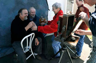
Fun and games during Bill Schwab's Wet Plate workshop at the New England Large Format Photography Collective conference. That's me and Paul Paletti (of the Paul Paletti Gallery in Louisville) posing with his booze (Paul manufactures a liquor named Dumonte), Marie staging, Steve Sherman enjoying it all and Bill Schwab behind the Deardorf. Photo by Robert Seto.
Bill Schwab is teaching another Wet Plate workshop at Project Baso the first part of May.
See also these posts below: Schwab and Sherman.
How To-Architectural Photograhy Books.....
I like the Norman McGrath book, "Photographing Buildings Inside and Out" and Julius Shulman's book "Photographing Architecture and Interiors". They are probably the best out there for view cameras and film. They have allot of good tips and insights. But speaking as someone who has taught this since the mid 80s, There is no book out there that can even begin to serve as a introductory textbook. The subject is just too complicated. IMO one first needs basic VC (or digital skills with T/S lenses and Photoshop) skills and then lots of practice on exteriors before attempting interiors and the complexities of lighting. IE get competent with the camera on exteriors and then tackle interior lighting. There is no book out there, that I have seen, that logically approaches the subject in a structured manner. I have been asked to review a few new books on my blog, but have yet to see a new one that deserves the effort. Maybe I should write it, but frankly I don't have the time. Any suggestions for books I may not have seen?
Wednesday, April 14, 2010
The Dwell "Look" or Unhappy Hipsters and the Deadpan Aesthetic.
Read this thoughtful blog post By Tim Atherton of the Blog "Musings" on the Dwell Aesthetic. Insightful and thought provoking.
See:
http://photo-muse.blogspot.com/2010/03/unhappy-hipsters-and-deadpan-aesthic.html
I know that some of my regular magazine clients are wanting to emulate that style and I have made some vague attempts. Examples to come.
On a mildly serious note, over the last few years it's been interesting to note how the "deadpan" aesthetic in photography - applied to both people and places - has eventually made its way from the edges through to illustration and advertising. From the New Topographics by way of New Colour and the "Dusseldorf School" etc. it has been showing up more and more often in ads and magazine articles. Nowhere is this more so than in the case of architecture, design and "lifestyle" magazines.
See:
http://photo-muse.blogspot.com/2010/03/unhappy-hipsters-and-deadpan-aesthic.html
I know that some of my regular magazine clients are wanting to emulate that style and I have made some vague attempts. Examples to come.
Tuesday, April 13, 2010
Stock sales booming.......?
Just a note to the faithful.......one side effect of the recession seems to be increased stock image sales. I guess maybe that is cheaper than the alternative of hiring another photographer to re-shoot a project. Since December 15 of last year, my stock sales have gone through the roof. In the last 3-4 months I sold more stock than in the previous 2 years combined. Your thoughts?
Video and Architecture and a Canon 5DII
At the request of a magazine client who I shoot stills for, I am getting into shooting video for their website. This is another way to diversify my income in these difficult times. Video is something I had always wanted to get into so this is a good inducement. I have directed videos before, working with the skills and equipment of a professional crew before, but done no shooting on my own.
Shooting video, even D&D for basic usage like websites with a 5DII, requires some additional tools. At a minimum I will need a fluid head for panning, and working knowledge of a decent editing program like Final Cut Pro or Adobe Premier. I'm sure as I get into this I will find more weaknesses in my equipment and computer skills. I will periodically give updates as this new endeavor progresses.
If someone thinks that trying to shoot professional video with a 5DII must be a joke..........the final episode of HOUSE (see Gismodo) is being shot with a 5DII!
Anyone out there been down this road, shooting video of architecture?
Monday, April 12, 2010
Bill Schwab's Vision
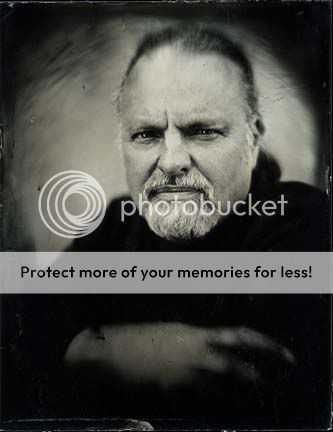
While at the New England Large Format Photography Collective symposium last week where I was presenting on my work and leading a shooting session to the old Harford City Hall (see below), I had the opportunity to meet (and be photographed in Wet Plate Collodion!) an artist who work I have loooong admired, Bill Schwab of Detroit. Bill has IMO one of the more elegantly personal visions around and produces prints of startling simplicity, elegance and beauty. Though not architectural photography by and large, he's mainly a landscape photograher-anyone can enjoy and learn from his unique vision. Bill Schwab Photographs
A fine portrait of me in Wet Plate Collodion he did while at the conference.
FYI, Wet Plate Collodion is an antique photographic process invented in about 1850.
A fine portrait of me in Wet Plate Collodion he did while at the conference.
FYI, Wet Plate Collodion is an antique photographic process invented in about 1850.
Masters at Work-Steve Sherman's Hartford City Hall Portfolio
I spent last weekend at a wonderful event, The New England Large Format Photography Collective annual get together in Hartford Connecticut, a truly great bunch of artists and their families. On Sunday I led a shooting session in the old Hartford City Hall, a fine example of turn of the century grand municipal architecture. No one has ever photographed this structure better than my host, the very gifted Steve Sherman. See his ongoing portfolio at: Steve Sherman's Hartford City Hall Portfolio. His superb images capture the essence of this historic building in all its classic elegance. See all his work at the main site: Steve Sherman Photography.
Sunday, March 28, 2010
Basic Interior Tips.....
I ran across some useful basic tips for shooting interiors. These should be valuable to beginners. The points in "Removing Distractions" reflect common mistakes by newcomers that I wholeheartedly agree with.
NYIP Techtips
NYIP Techtips
Thursday, March 25, 2010
New Photoshop CS5
One of the more exciting tools that appear to be in the new CS5 is the "Content Aware Fill" tool. Look at this video and imagine how useful this could be for removing obnoxious elements like exit signs in interiors etc.
Content aware Fill
Content aware Fill
Monday, March 15, 2010
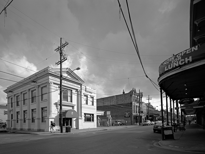
Documenting New Orleans-The Passion of Ed Richards
In the finest tradition of large format documentary photography, my friend Ed Richards has been documenting the aftermath of Katrina and the evolving urban landscape of New Orleans for many years. See his work at his website. When we are taking images we oftentimes don't realize their long term historic value. It can be satisfying in the moment to make some great images, but the real social value may not be evident for decades when the images give others a window into the past. My hat goes off to unsung artists like Ed whose passion is now but who's true reward may not be realized even in their lifetime. Like Atget, their impassioned artistry are the bedrock of historic preservation and vital to the understanding of generations to come.
Tuesday, March 2, 2010
Artist Andreas Gefeller
After reading a recent copy of American Photographer, I became aware one of the more interesting photographic artists working architecturally (whatever that means.....). I don't know how to classify him exactly, but his work, especially the Supervisions series, is intriguing. He documents the interiors of entire floors of buildings from ceiling height and then stitches the images together for a complete floor-scape. Clever. See this interview by Joerg Colberg:
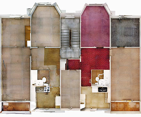
Image from J.L. Colberg's Blog.

Image from J.L. Colberg's Blog.
Bump-Tripod heads

In response to a question from Ed, I have made an important late addition to the recent thread on Tripod Heads.
Blogs-Christopher Barrett's One Point Perspective
An interesting Blog from one of my favorite architectural photographers, Christopher Barrett.
Chris, a Chicago based photographer, was with Hedrich-Blessing for like 20 years and is at the top of his game.
Chris, a Chicago based photographer, was with Hedrich-Blessing for like 20 years and is at the top of his game.
Shulman Film- VISUAL ACOUSTICS
Jim Hunter reminded me that there is a Julius Shulman film circulating Visual Acoustics-a must see for all architectural photographers. Just check the Screenings link occasionally to see if it is coming to a venue near you. Maybe Netflicks will get it!
Sunday, February 28, 2010
While I am waxing nostalgic, another great architectural photographer from the previous generation was Morely Baer. Morely was notable both as a fine art landscape photographer and commercial architectural photographer, a duel career which is hard to pull off. He is one of my personal heroes because of that successful dual career. Unfortunately I never met him, though I have a couple of friends who knew him well and greatly respected him. He was renowned as a teacher too. Here is a moving remembrance from John Sexton.


An interesting historical look at the architectural photography of Maynard L. Parker, a California photographer who's career is synonymous with House Beautiful and early West-coast residential Modernism. California and the Postwar Suburban Home.
Allot of the work looks quaint compared to his contemporary, Julius Shulman, but Shulman photographed allot of the important monumental Modern architecture of his time, which wears better on our sensibilities, I think.
Friday, February 26, 2010
The Ultimate Architecture Camera? ARCA RL3d
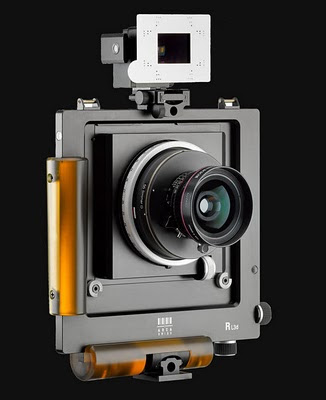
“Need a few more million?”
“The RL3d is the dream camera for 4x5” photography”
“A universal system with modular elements”
The new RL3d is available now!“The RL3d is the dream camera for 4x5” photography”
“A universal system with modular elements”
This state-of-the-art professional viewfinder camera comes equipped with new functions for making great high-resolution images both digitally and on film. Following the success of the Rm3d, ARCA-SWISS has introduced the RL3d, a universal camera with increased shift, opening up new horizons by enabling you to take images in multiple formats up to 4x5.”
Capture the real moment
Ever dreamed of a few more million? Or wished for higher resolution? The RL3d, with its ability to produce images of over 200 Mb, will make your dreams come true. It allows you to take fantastic quality images – from medium format to 4x5” - with the utmost ease and efficiency, using a high precision hand-held camera.
Despite its solidly build quality, the RL3d remains light and compact and ideal for location photography.
The ARCA-SWISS R-Line has six exceptional functions to improve efficiency and ergonomics and help you capture all sorts of images:
- All In Plane vertical and horizontal shift
- An integrated ± 5° horizontal or vertical tilt function to provide optimum sharpness where required (Scheimpflug effect)
- Focus distance can be measured and displayed electronically
- Camera level can be found electronically* or using conventional spirit levels
- The camera comes equipped with focus sensors; framing is achieved using the new variable Vario viewfinder which covers focal lengths from 23 – 210mm.
- Lenses are fitted onto the ARCA-SWISS R via an exclusive bayonet mount. By equipping lenses with a bayonet mount and by opting to link the optical system to the helical focus mount, they can be used both on the RL3d and Rm3D, as well as a bellows camera.
* via the electronic module. An optional accessory. For further information, see page 3
Versatile
Photographers using the RL3d will be able to take pictures on film or digitally in a multitude of formats up to 4x5”. Thanks to ARCA-SWISS’ wide selection of interface plates it is possible to take anything from medium format
images through to panoramas. The extraordinary versatility of the modular ARCA-SWISS photographic system
enables you to use elements from the F- and M-Line cameras as well as a binocular viewer, lens hoods, bellows and other accessories to significantly enhance the functionality of the ARCA-SWISS R-Line.
The optional electronic module extends its versatility even farther as it electronically calculates and displays data relating to level, distance from the subject and focused distance, as well as depth of field.
The quality of the image is determined by the choice of digital or film back, and by the type of film or format selected. It is easy to use as a hand-held camera and enables you to do away with a tripod, particularly in tricky situations such as construction sites, working on scaffolding or even on ladders.
RL3d® technical specifications
Horizontal Shift 40 mm (20/20)
Vertical Shift 50 mm (10/40)
Tilt (horizontal or vertical) ± 5°
Weight (body only) 1500 gr
List Price $ 6490
(body, international back with ground glass and Fresnel lens)
Why stop there!
The ability to shift the lens has eliminated perspective distortion and the tilt or swing movement has extended the depth of field. The integrated bubble levels make it easy to keep the camera level, ensuring images are perfectly straight and accurately reflect reality. The shape and position of the hand grips make it easy to switch between landscape and portrait without having to change the position of the viewfinder or back.
Lenses are mounted using the exclusive ARCA-SWISS R bayonet system attached to a helical focus mount.
Its large diameter does not restrict the choice of lenses. The micro-precision helical focus mount, which has precise control using 1/100mm increments, is part of the R-line body guaranteeing extreme precision. The very bright multi-focal zoom viewfinder eliminates stray light and informs the photographer what movements are required. It also offers tips: points of light appear in the viewfinder generated by the format mask to indicate the amount of shift required. Each point of light equates to 5 mm of shift. The viewfinder bracket is identical to the tripod bracket, enabling the photographer to turn the camera over and thus achieve the maximum amount of shift both upward and downward.
All cameras come equipped with focus sensors. The electronic functions are provided by a separate optional electronic module that provides a wealth of information! It uses a ultrasonic device to measure the distance between the camera and the subject and also provides information on the distance on the focus ramp, the depth of field covering four F-stops and the camera level in any position.
The ARCA-SWISS R-Line cameras come with two built-in tripod mounts for regular or up-side-down configuration, but can be also slid onto a monorail to attach a bellows for the use of longer focal lengths. The R-Line extension kit provides a variable extension for use on long focal lengths or for still lifes.
The unique ARCA-SWISS Rotaslide® sliding back enables you to switch quickly between ground glass and digital back. This sliding back also enables you to rotate the digital back from landscape to portrait without having to remove it.
A wide selection of film and digital backs can be fitted to the ARCA-SWISS RL3d. A high-quality camera for high precision, high quality work!
Press contact: Maud Huot-Marchand - Email: comm.arca-swiss@orange.fr
MY thoughts:
Really sweet camera. I know of a couple of top notch commercial architectural photographers who are planning on buying one. They really are the state of the art.
However, I'm not likely to be one of those purchasers unless I win the lottery, but heck if I win the lottery I can quit doing commercial work and just shoot my personal work on my beloved 4x5 Phillips and film! Frankly for commercial work, I do just fine carefully using a DSLR. A 21mp camera produces files that many of my clients consider are too large and the new Canon T/S lenses are superb.
Now, if I actually got the chance to try one out, it might totally seduce me.............maybe. I think not. Using the Canon 5D II and T/S lenses is so effortless and fun, creativity just flows.
I have never bought into the idea that you have to buy very expensive equipment to impress your clients. Heck in the view camera/film days I used a $175 used Calumet Wide Field for 15 years (and not at the beginning of my career either, but something like 1991-2006). What if-HEAVEN FORBID-your client owns a better camera than you do? Its not about who owns the best equipment-but about who can SEE architecture and utilize equipment to make that vision a reality.
Wednesday, February 24, 2010
Tripod Heads.
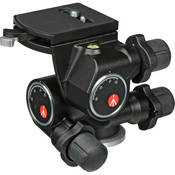
I was reminded about this again by a discussion over at Luminous Landscape. Over the years I have tried allot of tripod/head combinations for shooting architecture. After being introduced to the Bogen 410 head by some large format friends, I tried it and was sold-even for DSLRs. I never looked back, putting it on all my tripods. That was a few years ago now and I still consider them top notch. FWIW I also know some top national APs who swear by them too.
It allows for both quick gross adjustments and really fine adjustments. The quick release plate is rock solid and the whole unit can be found new for like $210-225! Yes there are better lighter heads from Arca, like the Cube, but LOOK at the price $1700!
Over time, the adjustments get a little sloppy, but the slack can easily be taken out by removing the caps and adjusting the set screw.
I love reasonably priced photo gear that gets the job done.
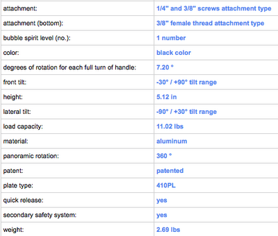
Late addition:
Ed has pointed out one problem with this design. You cannot point the camera straight up. This is rarely a problem for me, but Ed likes to shoot church ceilings. My solutions are to reverse the orientation of the quick release plate on the camera, effectively mounting the camera backwards on the head. This works perfectly but requires that you have a heavy duty screw driver or something with you to remove the plate and tighten it back down again. I like to keep my plates super tight. The other option is my preferred method. I carry a Manfrotto 394 Low Profile Quick Release Adapter with 410PL Plate (46.50 from B&H). With this I can quickly reverse the mounting position of the camera. It is set up permanently in the reverse position.

Saturday, February 20, 2010
Design Competitions-Beyond the Beauty Shot II.
Ed commented on the previous post via email:
A few thoughts from an architectural photographer who teaches at two architecture schools. I think Susan is exactly right in her assessment of the limitations of most design competitions, but who is responsible for those “pretty pictures” being submitted. The images I make for a client, such as an architect, have to serve many functions, including design competitions (documentary) and advertising (hyperbole). These are many times mutually exclusive in terms of how far I take the processing of the files. If the client thinks that the hyperbole is inappropriate for the veracity demanded by a design competition they could certainly ask for a “straighter” set of files-BUT NONE EVER HAVE! They are responsible for what kind of images ultimately get submitted for a given purpose. Design competitions are seen as a form of marketing and handled by the marketing department of most firms. More importantly, most design competitions are conceptualized by designers who have bought into the idea that design competitions are a form of marketing.
Interesting choice of words - I think I heard that before in my researchEd,
on VD.:-)
A few thoughts from an architectural photographer who teaches at two architecture schools. I think Susan is exactly right in her assessment of the limitations of most design competitions, but who is responsible for those “pretty pictures” being submitted. The images I make for a client, such as an architect, have to serve many functions, including design competitions (documentary) and advertising (hyperbole). These are many times mutually exclusive in terms of how far I take the processing of the files. If the client thinks that the hyperbole is inappropriate for the veracity demanded by a design competition they could certainly ask for a “straighter” set of files-BUT NONE EVER HAVE! They are responsible for what kind of images ultimately get submitted for a given purpose. Design competitions are seen as a form of marketing and handled by the marketing department of most firms. More importantly, most design competitions are conceptualized by designers who have bought into the idea that design competitions are a form of marketing.
I doubt that your average AIA design competition will change much. It is simply much easier and cheaper to email a PowerPoint submission to a judge 3 states away.
Wednesday, February 17, 2010
Design Competitions-Beyond the Beauty Shot.
Beyond the Beauty Shot
A thoughtful article by Susan Szenasy in Metropolis Magazine about the inherent problem of judging design competitions based on (our) "pretty pictures".
My main thought......she is absolutely right, though because of budget and time constraints this will never change, and......don't get your knickers in a twist.......for us (APs that is)....... its not our problem. We are just servicing our clients wishes.
Tim Street-Porter
There is a good article in this months issue of American Photographer on Tim Street-Porter, an LA based architectural photographer. He is one of the best. His books on Mexican Style architecture are classics that defined a genre. Unfortunately the article is not online so you will have to dig up a hard copy. According to the article is just going digital finally this year.
Tim's Website
Tim's Website
Tuesday, February 16, 2010
Is there a future in Architectural Photography?
Dear Kirk,L,
If you have a moment, I would like to ask your opinion about the current state of art and commercial architectural photography. My name is Lauren (27) and I'm interested in becoming an architectural photographer. I don't have formal background in photography, but have been learning architecture and photography on my own.
Yet, I'm hesitant about this career path because I'm unsure of the future state of it. The photography field seems so saturated with newcomers and to only want to specialize in architecture seems very limiting as well.
I've looked into the different paths of obtaining my MFA for personal growth or assisting a photographer, but as I have spoken with another photographer, I get the sense that this is not a niche field (architecture) as it used to be and because the photography field in general is saturated, commercial jobs are few and far between.
Is it possible that you can give your opinion on the state of the industry?
Thank you for your time,
L (via email)
A great question that I'm sure many people are pondering, especially in the economy.
There is an old adage in commercial photography, "There is always room for someone good". Yes there are tons of newcomers largely because of the accessibility to quality images because of current digital cameras. But in my area these newcomers tend to be lacking in an understanding of architecture, vision (which can be refined but not taught) and the basic canons of architectural photography like perspective correction (because they didn't learn the trade with the difficulties of film and view cameras). Many seem to think that poor technique is some new creative vision. One stands out from the crowd with refinement, not poor technique masquerading as cleverness. Hence these poorly trained newcomers seem to have no real impact on the knowledgeable market, where the decent budgets are. With the advent of reasonably priced high quality digital, used by inexperienced and low priced competition, my business has boomed. The economy scares me, but not the competition.
The AP market will evolve, but I don't see a time when it will be irrelevant. Computer graphics (CG) will make renderings and retouching seemless and believable, but there will always be a need for high quality interpretations of actual buildings as they were built for magazines, design competitions, portfolios etc. That is the strength of good APs. We can make anything look good.
You don't have to go to a formal school to become a top-notch architectural photographer, but you do have to school yourself. Assisting and workshops are a great source of knowledge as is studying the work of masters and trying to emulate it. With digital there is little cost (beyond the equipment) to practicing. You don't have to spend tons of money on film and processing for example. The drawback to self-education vs. formal education is the lack of constructive criticism. Most people have a hard time taking a good hard objective look at their own work. So in that regard, I am a believer in formal education and the kind of mentoring one can get in that environment. However, many of the greats have not had a formal photographic education. I came from both camps. formally trained in art schools, but learned the specifics of architectural photography totally on my own.
I don't know if that helps.
Kirk
Response from L,
Thank you Kirk for taking the time out to reply honestly. I'm still undecided on a concrete plan of action and I think it's going to be a long process of thought and action, but your perspective is helpful and appreciated. I'll keep researching, attending workshops and taking art classes.
Wednesday, February 10, 2010
Changing Aesthetics in AP
See this article: Photographic Greenwashing. It closely follows some of my thinking lately in trying to understand what my clients, particularly magazines, are having a difficult time articulating.
Tuesday, January 12, 2010
Sublime Architecture Video
If you haven't seen it, this is an almost sensual video of architecture by Alex Roman. A few readers of this blog have pointed it out to me. Enjoy Alex Roman Video.
Subscribe to:
Comments (Atom)


