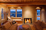
On a mildly serious note, over the last few years it's been interesting to note how the "deadpan" aesthetic in photography - applied to both people and places - has eventually made its way from the edges through to illustration and advertising. From the New Topographics by way of New Colour and the "Dusseldorf School" etc. it has been showing up more and more often in ads and magazine articles. Nowhere is this more so than in the case of architecture, design and "lifestyle" magazines.
See:
http://photo-muse.blogspot.com/2010/03/unhappy-hipsters-and-deadpan-aesthic.html
I know that some of my regular magazine clients are wanting to emulate that style and I have made some vague attempts. Examples to come.


No comments:
Post a Comment