Tuesday, December 8, 2009

Believeable HDR?

Is there such a thing as believable HDR? A couple of years ago I would have said no. See these examples HDR which are typical of all the HDR that was around a couple of years ago when it first got "hot".

I shoot a fair amount of homes by custom builders to fill in the gaps between big commercial jobs. The budgets are low so I need to work quickly. I have to squeeze a decent set of shots out of a limited time even if the light is not primo. Here is an example of an HDR that to me works (a little surreal I admit). The day was bright overcast. The sun was high and above left. The area under the porch was too dark. If I exposed for the porch the sky blew out. A pain to try and light the porch. Three exposures-2 stop range. Exposure Blend in Photomatix. HDR always needs some additional adjustments in PS after the blend, because the midtones tend to get a little flat and lifeless. I like Tony Kuyper's Luminoscity Masks for this. HDR is just another tool if used appropriately.

Show some of your examples.

Before


After


Client comments-the contractor loved the HDR because you could see all the rich detail under the roof. He thought it "really came alive". To satisfy him any other way would mean I would have had to light it. It also ran full page in an article in a homebuilder magazine. The editor, my primary client, thought it was a bit "surreal" and didn't like it that much but ran it, but I didn't hear that until after it ran. It could be toned down slightly and still be effective. Personally I like the HDR (I grant you a bit tooooomuch maybe). The straight image just sits there, muddy and lifeless.

Monday, December 7, 2009

No more Olympus 35PC...


My new Canon 24 T/S II is a significant improvement over the old one....real comparison test to come....it is worth every penny.....but also ..... on a related note. Rainer V. mentioned in a Luminous Landscape thread that the new 24T/S worked well with the Canon EX 1.4xII extender (which I already owned). Indeed it does by my tests. It creates, a what, 32mm lens? I have always carried an Olympus 35 PC with a Canon lens mount to cover that mid range between the 24 and 45. The Olympus is a pretty good little lens, but the Canon 24 T/S II with the extender surpasses it in terms of resolution, CA and shift range. So I will no longer carry my little Olympus 35PC, but use the extender, which I already carried to extend my long zoom lens, on the new 24 instead. Sweet.


The extender is smaller, lighter and only about $300 from B&H vs.$500+ for a mint copy of the Olympus 35PC.


Check out how these new lenses compare favorably with even a MF system.

Also see:
See

Thursday, December 3, 2009

Commercial photography stressful?

You've heard and imagined all the romanticism about making your living as a photographer.....CNN

Wednesday, November 18, 2009

Tight Interiors

Interesting approach to a tight interior shoot By Craig Lamson. This basic technique I have used too, though not quite so involved-mainly to hide my strobe light sources by merging layers in PS:

http://www.craiglamson.com/421.html

My 2010 Teaching Schedule

If anyone is interested, I will be teaching architectural photography at some interesting venues this coming year.

The first is a summer credit class primarily for university students, at The School of the Art Institute of Chicago. where I have been asked once again to be a Visiting Artist. This class is jointly offered by the departments of Photography, Historic Preservation and Architecture, classes are Monday, Wednesday and Friday, June 1st to July 9th 2010. I don't have the class number as yet-the official class schedules are not posted yet. This class is a bit pricey (especially if you include lodging in Chicago for 6 weeks) but has attracted students from all over the world. It is primarily DSLR digital. I actually lose money teaching this class (by missing assignments) but I love the interaction with the students and being in Chicago.

The second is a workshop in Hartford Conn. at the New England Large Format Photography Collective annual conference. This workshop is about seeing architecture and is set in the historic Hartford City Hall. It is a Sunday morning workshop on April 10th 2010. The cost is very reasonable and included in the cost of the conference. This workshop is primarily largeformat

film.

Attached Image
see:NELFPC and scroll down past where I am giving the Friday evening talk to the workshop on architectural photography. There are many other interesting presentations at this conference and well worth the cost.

Email me if you have any questions.

Tuesday, November 10, 2009

Wednesday, October 14, 2009

The magazine business..........

"Condé Nast is to close four magazines: Gourmet, Elegant Bride, Modern Bride and Cookie."

Conde Nast

Metropolitan Home has gone under too!

Work is booming but cash flow stinks.

Commercial photographers and artists-where we are at......?

The market for stock and assignment photography is shrinking rapidly. I have had to cut fees to assignment magazine clients and more and more stock clients are looking for virtual freebees. With some magazines that have been my bread and butter, I don't mind cutting fees (many as much as a 1/2 cut).....if they stay in business it is an investment in future business, but it is disheartening after thirty one years in this business, at almost 60 years of age, to have to revert to an income level of 15+ years ago. That 1/2 cut is all profit as expenses have not gone down-virtually halving my real income from these sources for the same amount of work.

Fortunately, the architectural market (after a serious first half slump) has rebounded well in the third quarter, largely making up for the first half slump, but payment is very slow. Diversifying, I have won some public art commissions but the paperwork is so slow I may not be still kicking before I see a dime from them.

My son's business (who is the head web guy for a large national ad agency) is booming and they are hiring for next year, while my daughter-in-law's custom wedding accessory business (75 outlets nationwide) is just starting to feel the pinch this quarter after expanded sales in the first two quarters. The magazines she advertises in have all cut their page rate with the exception of Martha Stuart Weddings which has raised theirs.

According to the American Institute of Architects, next year will be worse than this year. Fortunately some of my best clients are the only architects who are booming in the state and perhaps that will save me next year.

What is happening with you guys?

John Sartin replies:

Kirk,
I am distressed to hear that someone as established as you is also struggling in these bleak times. I am a small time local freelancer and I am really feeling the pressure. Every niche I used to count on is way off. High end real estate and building is almost non-existent. Artists that I used to do portfolio work for are not selling so they are not shooting new work. I used to get regular work from my local university but their funding has been slashed. It is definitely tough out here right now.

Photographers are reeling from the double whammy. Not only are we experiencing the effects of the recession but the industry in general has been undergoing a transformation that is redefining how images are captured, delivered, marketed and (de)valued. Wow my head is spinning just thinking about it. We certainly are living through interesting times.

Thursday, September 3, 2009

New comments in thread on "DSLRs in the BIG City"

Bump. There is a bit more discussion in this thread if you haven't been back to it since the beginning.

DSLRs in the BIG City

Thursday, August 27, 2009

Polaroid's Demise

Polaroid's ongoing demise reflected in the recent hubbub surrounding the sale of their photography collection, got me thinking about what a great asset they were to photographers over the years. See Polaroid

Michael T. pointed out recently "Miraculously Polaroid film and instant cameras are being resurrected by the last team and factory in Europe. Check out: www.the-impossible-project.com". This is potentially very good news, we will have to see whether the new products fit the needs of photographers.


In the late 80's I received an National Endowment of the Arts grant to photograph historic churches in New Mexico. It was a very worthy large scale documentation project of about 600 historic, largely Hispanic, Catholic churches in Northern New Mexico. The NEA grant was not going to nearly cover all my expenses. One of my sponsors was Calumet who was loaning me a substantial amount of equipment and giving me photographic paper for the project. Realizing my additional need they also recommended me to Polaroid Artist Support Program who supplied me with instant films for proofing and the what we affectionately called Fujiroid (4×5 Fuji transparency films in Polaroid sleeves-the original readyload) for the duration of the project. Their help was crucial to the success of the project and I will be forever thankful to them for their help.


Tuesday, August 25, 2009

DSLRs in the BIG City

Having just spent some time in Chicago photographing medium size sky scrappers with little room to back up, I have come to a conclusion. DSLRs and tilt/shift lenses are really stretched beyond their limit in big cities and are of marginal quality in situations where tall vertical structures are the norm. Horizontal structures like the Modern Wing shown in the post below photograph fine. But on tall vertical structures you end up using all of your rise, but you still end up having to tilt up and subsequently correct some perspective in Photoshop with all the interpolation that goes with it. I am not fully happy with the results compared to what I get photographing the lower buildings that you can stand back from in the Southwest. With lower buildings you do not use the outer limits of your lenses where resolution really suffers. My verdict? If I had to make my living working in the Loop in Chicago, I would definitely look at a first rate medium format system such as the Sinar. Of course if my primary clientele was in the Loop of Chicago, I could afford a first class medium format system.

After thinking about this today, Duh! I think my solution would simply be to revert to using my trusty view camera and scanned color negative film next time-simple cheap and fully capable of doing the job.

From Ed,

I tried posting this to the blog but I did not have the appropriate accounts. I have also struggled with the verticality of the city (I'm based in Boston) and DSLR shift lens limits. I am a stitcher also. There are a few options I've been looking into which you may already have seen that look promising. A company called Zork makes a 35mm dslr shift adapter which adapts the use of medium format lenses (645, 6x6, 6x7) allowing up to 20mm of movement if you go with 6x7 lenes. I'd probably stick with the 645 format due to the availability of a 35mm lens for up to 17mm. Since we are both used to stitching images anyway, having this level of shift could be very useful. It also allows sliding back movements for parallax free stitching which is huge. Photomerge in PS is pretty good but I occasionally get misalignment of tall building mullions if I'm up close with a wide-angle. Medium format resolution, and wide angle of view without the wide angle distortions. The tradeoff is more work at the desktop. Another option I have considered is going to medium format as you suggest but a $50k+ investment in the Sinar or a Hasselblad Shift system is just not going to happen. Zork to the rescue again. They make a MF shift adapter that uses 6x7 lenses (Pentax 67 are pretty good and cheap). The setup I am contemplating is a gently used Contax 645 (~$1,500), The Zork adapter ($1,500 which seems pricey for what it is but what are you going to do?), a range of 5 Pentax 67 lenses (~around $2k for all 5 from KEH.com!) and a factory refurbished Phase One P25 22mp back (which is fine resolution-wise since we are stitching) from Calumet for around $12k. Total cost around $17k. That is still a chunk of change but way less than the Sinar or Hasselblad. I probably have $10k invested in 35mm so not so far off. Maybe you would be so kind as to try out these options for us and report about it on the blog! Also, check out 16-9.net. Here is a link to a roundup of possible shift solutions for anyone used to working in 35mm DSLR:

http://www.stitchpix.com/options.html

Avoiding Parallax:

http://www.outbackphoto.com/workflow/wf_58/essay.html

Other Links:
http://www.zoerk.com/pages/p_psa.htm http://www.contaxcameras.co.uk/645/645.asp http://www.keh.com
from David:

Regarding your recent comments on shooting tall buildings in the city: wouldn't the new Canon 17mm ts-e be of some help here? I know, you'd have to crop somewhat, which reduces quality, but wouldn't that at least be preferable to perspective correction in Photoshop?

Some further thoughts. The issue for me is simple. I have written many times that, coming from 4x5, to get acceptable quality from a DSLR requires very very careful work, minimizing everything that might diminish image quality like , camera movement, cropping, lens distortion, shift limits, diffraction, interpolation etc. In Chicago shooting in the Loop, where my 24 t/s had insufficient rise resulting in stitching vertical frames (that had some necessary converging vertical lines), that too many image deteriorating factors came into play to give me the quality I want. In many cases (street corner buildings) I simply could not get back far enough to avoid these issues. These factors included barrel distortion correction, significant perspective correction and cropping. In one situation I had to shoot from the middle of the street in a crosswalk and actually had to handhold the camera a situation which makes my skin crawl.

Now these images are not being used large, websites or catalogs, and with allot of work I can make them acceptable, but I always try to exceed my clients expectations. I have said before, if you routinely exceed your clients expectations, your clients recommendations will become your best advertising, if you exceed their expectations too much you probably will not be profitable and won't be able to make a living. In the short run to build your initial portfolio this may work, but in the long run you need to control your costs and be economically competitive.

The easiest solution is simply to go back to using my view camera for these shots but I did not anticipate this problem. Using my Schneider 47XL and a center filter (to correct for the lens fall off) on roll film would have worked because of the significantly more rise and less lens distortion I would have had compared to the DSLR with last generation T/S lenses (I would have bought the new 24 before the trip if I could have found one with a US warranty. It at least has less distortion) or use a good 75mm on 4x5. In the comments below another Ed, from New Orleans, suggests a similar and very viable retro option:

For the $1500 the adapter costs, you get a Sinar F2, 90mm and 75mm lenses, and do a better job. Since you are shooting for a client, the film cost should not be an issue.

Kirk, could you elaborate a bit on working in tight city spaces with the view camera? I am doing more shooting in New Orleans, which has some wonderful late 19th century, early 20 century facades, but also has some pretty narrow streets. Should I start saving for a 72mm XL?

Ed from New Orleans,

As you know your solution is perfectly viable and very inexpensive. Film for me can no longer supply my needs for commercial work as we no longer have a lab in this town and doing color myself or shipping it out is just too slow a turn around. BUT for odd necessary shot or my personal work that is no problem. I have coveted but never owned the Schneider 72XL for 4x5. I have owned 75s and 65s but those were of limited coverage on 4x5 and not suitable for extreme rises for tall buildings. If I remember right the 72XL has great coverage (like 226 mm diameter circle of coverage-that is a front rise of 48 mm with the XL vs. 31 mm with the 75 ) and should do the trick. As you are scanning your film you can get by without a center filter which helps alleviate falloff. I have successfully used a white gradient for years to fix falloff. You also need a really solid camera and preferably bag bellows. The extreme movements needed with even a very flexible "universal" bellows can force the front standard to tilt forward with extreme rise. I also prefer for my large format architecture lenses to mount them above center on the lens board to maximize rise. We always seem to need more rise shift than fall (and we can always reverse the lense board and mount it upside down to get more fall). This discussion makes we want to break out one of my 4x5s (I still own two) and go shoot some film! One other thought, though the ability to actually use this solution is rare. Check and see if there is a roof or window across the street from the building you want to shoot that is about half its height. That alleviates the need for such huge coverage lenses and provides an interesting birds eye view from about mid elevation of a tall building. It is also visually appropriate to leave a slight amount of convergence on really tall buildings or they tend to seem like they are falling forward Think also about using really long exposures to significantly blur cars or people. It is virtually impossible to avoid them when the light is right on a building so blur can make them less distracting and provide a juxtaposition to the solidity of the structure.

The solution David suggests about using the new 17 T/S above may have worked but includes significant cropping and may compromise the file to much. It is hard to say without testing that lens. The suggestions of Ed to buy a used Contax 645, Pentax lenses and a Zork adapter......I wonder. Those Pentax lenses don't have that much excess coverage beyond a 6x7 negative size. How much shift are you going to get? I will not be trying any of these options myself soon as my equipment budget for the near future is the new T/S Canons, a new computer for file editing and my oldest daughters upcoming wedding!

From Tonnes:

I suppose if you were in a bind with nothing but your digital camera and didn't have enough rise using your 24 TS-E, you could use a really sharp tele like the 85mm F 1.2 or 1.8 and shoot a vertical panorama of the building. Provided you had enough time to shoot the sequence and you're comfortable using a stitching program like PTgui, the resulting gigapixel image would interpolate very well when you corrected the verticals, no? But ultimately if you try to shoot a tall building from too close, regardless of how the verticals are corrected (optically or in post), things can look weird - namely, the windows get progressively shorter towards the top.
Tonnes,

As you say, in my experience with that kind of complex stitching of buildings from close up, there is always a fair amount of distortion that cannot be adequately corrected, and the resulting files are just not up to the standards or me or my clients. From a distance this is not an issue and multi-tile stitching is a great way to build quality large file sizes (of potentially unlimited file size for huge prints). Also, for me anyway, AP has become a bit of a volume business and I would rather invest in the proper piece of equipment so I can work quickly rather than laboring over multi-tile stitches and assembling them and correcting them in PS. Billing for all of that would not make any sense to my clients.


More to come.......

"What is the Difference Between Art and Fine Art Photography?"

An often asked and good question, one I contemplated allot when I was a student and am still to this day trying to figure this issue out. It is hard to define because we live in an artistic environment which attacks neat definitions and tries to destroy conceptual boundaries. So really the best I can do is give some personal reflections.

I think the Wikipedia definition is a good starting point though:
Quote:
Fine art describes any art form developed primarily for aesthetics and/or concept rather than utility.[1] This type of art is often expressed in the production of art objects[2] using visual and performing art forms, including painting, sculpture, music, dance, theater, architecture, photography and printmaking. Schools, institutes, and other organizations still use the term to indicate a traditional perspective on the art forms, often implying an association with classic or academic art.
In my own lexicon, as both a commercial architectural and "fine art architectural" photographer, I find the first sentence of the WP definition to have some merit. Though the boundaries are certainly not distinct, in my commercial work as an architectural photographer, much of what I do is find ways to illustrate the aesthetic ideas of my clients ie interpret someone else's art. I am oftentimes trying to get into the head of my client and create images that are artistic but useful (have some utility) to them in design competitions, proposals slide shows etc. Aesthetics and illustration must be balanced lest you stray too far from your clients needs. Vice versa if you don't pay attention to aesthetics then you create boring documents, which may not "sell" your clients work well. At the far aesthetic edge of this commercial work are those clients who want me to just go out and "do what I do", which means to interpret their work aesthetically. See this Abstraction thread in my blog. To use this image again for an example- while making this image last week of the modern wing at the Art Institute of Chicago, my assistant remarked something like "that looks allot better than the building actually is". To which I said this is more like advertising photography than documentary". A former student of mine, he does HABS documentation and is quite good at it. Actually in all fairness the Modern Wing at AIC is an extraordinary design and photographs are hard pressed to do it justice.


An effective commercial architectural image illustrates and sells the clients creations. It is all art but different in concept and approach and intent than my personal work which when successful I refer to as my Fine Art. The fine art is intended primarily for aesthetic contemplation, though there is a visual reality to work from and oftentimes there is a descriptive intent such as trying to bring to life the spirit of a particular place. Aesthetic contemplation is a kind of utility but far more personal than public as in my commercial work. The FA work also illustrates but it is illustrating my feelings about a place as much as its visual reality, which leads me to much manipulation of tone etc that exceeds documentation. So aesthetic contemplation, strictly speaking of is role in my life has a more profound purpose and personal utility and I distinguish that as my Fine Art.

There are huge areas where my own definitions don't hold much water. For example I have been part of city public arts commission projects with fairly strict limits on subject matter. Is this commercial illustration or fine art? I have struggle to accomplish the latter while honoring the boundaries set by the city/client. Many observers of my work don't see my distinction between commercial illustration and fine art and see the commercial work equally as creative as the FA and the FA work equally as grounded in real time and place as the commercial work. Also ironically, some of my favorite FA work has come out of HABS documentation projects. For me it is a personal distinction that helps me focus on what is important in each endeavor, but not an aesthetic straight jacket.

Just some of my personal views on the subject based on my own work............and an example of the personal FA work, the upper Morada in Abiquiu. Does any of that make any sense?

Wednesday, August 19, 2009

Shooting for magazines for free?

This post comes from a thread on Luminous Landscape (Free).

Do magazines in areas like food/architecture/sports, etc. expect photographers to work for free?

Magazines that EXPECT photographers to work for free are probably marginal and won't give you the exposure you expect. Any quality publication EXPECTS to pay for photography though the rates may be pitiful for assignment or stock.

I happily do allot of editorial, mostly architecture related (but not exclusively) for local, state , regional and national magazines. Though mostly architecture, recently New Mexico Magazine asked me to illustrate an article on Rudolfo Anaya, a friend I rarely see. It was a treat to work with him. he is a state treasure. The fees were adequate. Overall, the rates are poor right now with some magazines (but not all), but far from free and the difference I can often make up in the stock sales of images from these shoots. These editorial shoots also generate client contacts, high profile exposure and keeps my assistant working during slow times. Editorial also gives me access to unusual locations for my personal work and gas money to get there on someone else's dime. Editorial and the stock it generates is now and always has been been a vital part of my income and marketing strategy. With most magazines my fees are reduced but I have gotten full fees from some publications (pre-recession).

The only time I do free work is for friends, family or occasionally non-profits I support.

Thursday, August 13, 2009

A Chicago Trip

I've been in Chicago on an extended shoot and will get back to blogging after I return and get some rest. I love this town. It is a museum of great architecture. Here is a quick sample from the trip, Renzo Piano's new Modern Wing at he Art Institute of Chicago. It is one of my favorite pieces of architecture I have seen in years. Superb.

Wednesday, August 5, 2009

Julius Shulman Passes at 98


The Kaufman House, 1947

Julius Shulman, probably the most prominent architectural photographer of the 20th century has passed. His work defined early modernism in the architecture magazines. The book "The Photography of Architecture and Design" is a classic that influenced virtually every AP I know, myself included.
Julius Shulman


Monday, August 3, 2009


Photographer Laura Gilpin Comes to Life
A Through the Lens Chautauqua event
6:00 pm to 7:30 pm
Deborah Blanche will recreate the life of legendary Santa Fe photographer Laura Gilpin during a Chautauqua performance in the History Museum Auditorium, 113 Lincoln Ave. A free, public event.

In this show, meet “Miss Gilpin” as she was in the year 1954 – a confident, ebullient woman in her early 60s. As Miss Gilpin, Blanche narrates a slide show that includes images from the photographer’s first Lumiere color prints to many from her best-known book The Enduring Navajo. (The slide show of 30 pristine images is made possible by arrangement with the Amon Carter Museum in Fort Worth, Texas.) Miss Gilpin will answer questions from the audience and tell some of the behind-the-camera stories about the photographic retrospective that parallels her life.


Laura Gilpin was a pioneer of architectural photography in the Southwest, though she is best known for her landscape work. She was a principle photographer of the designs of architect John Gaw Meem, who many see as the father of "Santa Fe Style". Laura Gilpin and I had a show together at a long defunct gallery in Santa Fe back in 1973 or sometime. She was a great lady. I enjoy her work and life immensely. I think this Santa Fe program could be quite interesting if you are in the area. This is part of the "Through the Lens" exhibit, which I have a small role in.

Steps of the Castillo, Chichen Itza
By: Laura Gilpin (1891–1979)
Image is located at Amon Carter Museum, Fort Worth TX. Gelatin silver print (bromide) on Gevaluxe paper

Friday, July 31, 2009

Fine Art vs. Commercial Photography

from Max:
Hi Kirk,
I would like to say thanks for your dedication to fine photographs. I share your appreciation of architecture. I also like the way you've managed to combine your commercial photography preference with your artistic aspirations and vision.
I suppose it's a common struggle. Your site makes it all seem like one.
Thanks Max. "Seeing it as one" was a long journey. I "grew up" artistically in an environment that disdained commercial photography at the renowned University of New Mexico Photography Department of the early 70's. This was during the rein of legends such as Van Deuron Coke and Beumont Newhall. Commercial photography was somehow tainted. Some years after graduation, I got into commercial architectural photography because I had a family to support and I was not accomplishing that strictly doing art photography and showing in galleries. Mentally it was not a happy marriage. I considered art my passion and the other what I did to support my passion. That doesn't mean I approached architectural photography with a lack of sincerity. Everything worth doing deserves serious attention, but commercial photography was, in my mind, definitely a second class citizen.

I defined the distinction this way. My art was illustrating my own ideas while the commercial photography was illustrating my clients ideas, but over the years that commercial point of view didn't hold water. Clients were hiring me to see into their designs. They were asking me to interpret their art. Many of the best designers I worked for didn't even do a walk through with me-sending me out to "see what I came up with". They saw me as an artist interpreting their art (that isn't to say that there is not a documentary aspect to AP, because there definitely is. You have to show the building). Many of these same architects are aavid collectors of my b&w work too.

In 2003 New Mexico magazine approached me about doing a retrospective book of my work, which became Shelter from the Storm: The Photographs of Kirk Gittings. I suggested a collection of my B&W, but they wanted it all. It was inseparable from their POV. I could not figure out how this would work organizationally or visually. I tried many times to come up with a workable draft, but I couldn't see it and finally turned the project over to their designers. My conceptual separation of the work was a barrier, but not for them. This experience really made me re-evaluate how I see my commercial work. It is more seamless for me now as a result of that project. I learned allot from that experience. Is there really a fundamental difference where a commission comes from, whether from a commercial client, an arts program or my own internal quest? What about being invited to participate in a group exhibit with a theme? Here is an example from a show where 20 photographers were asked to photograph the same model. Model Rose Bryant photographed at the ruined 17th century church at Quarai (Canon 5D, 24 T/S).


The experience led me to (or back to really, I had played with this some years ago) an interest in photographing figures in architecture and landscape, and led to a recent arts commission to photograph figures in landscape around Albuquerque. I don't find client requirements to be barriers to creativity, but instead stimulus to creativity.

Tuesday, July 28, 2009

Stitching programs for files from Tilt/Shift lenses.


I do allot of stitching these days for clients, usually a half dozen+ on every shoot. An effective stitching program is a must. I have stated before that I prefer Photoshop CS4 Photomerge over programs like Autopano Pro or PT Gui for flat stitched architectural images and the images below will illustrate why. Above are jpegs of the original raw files, Canon 5DM2, Canon 24T/S. The method was to simply level the camera-shift up and expose and shift down and expose. NOTE, the camera must be on manual exposure and the white balance set (4000 K on this) so that the exposure and white balance does not change automatically between exposures (I only use manual exposure normally for architecture anyway and expose based on the histogram). Below are the renderings of the images in Photoshop Photomerge and Autopano Pro. AutoPano Pro with its "best" projection mode (Planar in this case). It introduces allot of pincussioning that requires additional time in PS to correct.

This file is straight from the raw files in bridge via the PS Photomerge script. Photoshop Photomerge preserves much better the straight lines of the original files,


I find Autopano Pro to be superior for large multi-tiled landscape stitches. It seems superior at blending edges in skies and finding control points in clouds etc. But for my daily architecture bread and butter with Tilt/Shift lenses? Give me Photoshop CS4 Photomerge.

I discovered this problem with architecture in Autopano Pro this week because my PS Photomerge could not align any two images to save its life. With deadlines to meet, I was panicking. So I tried Autopano Pro and PT Gui again. Neither performed as well as simple PS Photomerge. It turns out that my problem in PS was a corrupted Preferences file and as soon as I erased that (the program will recreate it) the stitch program in PS ran fine. People tell me that it is a good idea to save a clean copy of your preferences file and replace the existing one at the first sign of trouble in PS. Where this is located depends on your operating system and PS version. So you will have to investigate this online. It is a fairly well known issue apparently.

For an alternative take on AutopanoPro see Jack Flesher's post on LL

The Kira Sowanick, AIA, Residence, Albuquerque, NM.

Sunday, July 26, 2009

Sorry All

I have been absolutely buried with work and have had no time for the blog. I will get back with peoples comments and emails after the end of the month probably. There are three design competition deadlines at the end of the month-my yearly bread and butter. Thanks for your patience.

Thursday, July 9, 2009

Abstraction in Architectural Photography: some thoughts.

"Between documentation and interpretation? How much of each is necessary or desired?"

The answer for me, when the client is an architect, both. I am paid for both my eye and technical expertise. All photography requires interpretation just from the basic activity of framing an image, making a visual selection, but for some images it goes far beyond the process of selection. Over the course of an entire shoot, I must deliver images that both accurately depict the volumes, masses, setting, facades etc. and I must deliver images that interpret the feel of the design. It is in attempting to interpret the feel of the design where I am most aesthetically free. Here are a few examples that I did recently for a project. I'm never sure that the client will appreciate some of my more abstract interpretations, but usually my more creative clients appreciate my more creative images. Project, the Aperture Center, Mesa del Sol, New Mexico, Antoine Predock Architect.


Some of my favorite images of architecture are extreme abstractions that don't illustrate the physicality of a structure but speak to how design feels. Oftentimes these images fall on deaf ears (blind eyes?) and move no one but myself. But my more creative clients appreciate them. Here are examples from the Aperture Center shoot (above) designed by Antoine Predock FAIA with Jon Anderson Architects. Below are images I "encountered" while waiting for the light to get better!

Markets, Marketing and Fees: some thoughts.

Hey Kirk,
I want to compliment you on your blog. It's very informative and entertaining. I am an editorial and commercial photographer based in the Midwest. I have shot quit a bit of architecture in the last year for a few editorial clients. I find it very rewarding and am looking into shooting more architecture. I am wondering if you would be willing to share a little bit about your business model? My clients in the past have all been either magazines or advertising agencies. I am wondering who I should start marketing for architecture work. I'm also wondering how most people are charging? Day rates, project rates, usage?
Any info you can share would be greatly appreciated.


Thanks for the kind words. This is a big topic and I will add to it over the next few days so check back in. Who do you market architectural photography too? Who needs it the most? Architects, builders and "shelter" magazines. My largest volume clients are magazines, then architects and finally builders (and occasionally ad agencies). Part of that order is choice. I find builders to want the most pedestrian images and want bid photography, so they are my lowest priority (not always for sure, but generally speaking). Magazines have the most varied projects, which is stimulating, but generally don't pay great (not always though). Magazine work is your best advertising, so the low fees notwithstanding, magazines have their silver lining. Having studied art at the university level, architects and I speak the same visual language. I understand their needs the best and they value creativity. Hence, they the most
challenging and pay well.

My original strategy 30 years ago was to build a clientele amongst the less demanding builders as I built my portfolio, equipment and expertise. I then used that base for leverage to gain more lucrative and visually sophisticated design and magazine clients. For instance when shooting an important building for a contractor I would call the architect and ask if they need some photography too or want to share in the shoot. This strayegy worked so well that Iwould do it again if I had to start over again.

Variety is important from a economic stability point of view. When one market like residential may be down big commercial buildings may be stable or advertising in magazines may be booming. Right now residential is in the dumps but commercial is holding its own. That may switch next year as residential climbs out of the hole and commercial, which has a much longer lead time, starts to slow down. With residential seeing the light, magazine advertising (which pays for editorial) may boom as clients start to position themselves for the end of the recession.

Variety is also important in terms of keeping the creative juices flowing. A large office building is a very different challenge than a residence and I find those different challenges very stimulating.

There is no single fee strategy that works in all these markets. A national manufacturer will expect to pay far more than your neighborhood contractor. Day rates are still very common out this way, but even for me those vary tremendously depending on the size of the client and usage required. Fees for small local clients would make your skills suspect for large clients from major metropolitan areas. You need to know what is happening in both and position yourself based on your expertise and competition.

Without going into personal details, for a regular architecture documentation shoot, I have a shooting fee/day rate (which varies greatly depending on client), digital capture and processing fees (per image, multiplied for stitches, this is aimed at paying me a reasonable hourly rate for all the computer time), assistant fees, travel fees (if required), multiple copyright user surcharge (like say the architect and contractor want to split the shoot-it runs about half the shooting fee per additional client) and miscellaneous charges. These days we do approx. 30-40 images a day when documenting architecture, far more than we ever did with film (largely because digital is far more forgiving in mixed light situations so we can work faster). Art directed shoots for say a magazine will produce far fewer images.

Before the recession I was able to charge pretty much what I wanted without oftentimes even being asked for a proposal or estimate from established clients, but that has changed drastically. Recently I have even initiated significant fee reductions with some key magazine clients that are having trouble. Why? My business is largely built on long term relationships, some 30 years old now. We have gone through the highs and lows together and I want them to know I have not gotten so established that I'm inflexible and that we are still in this together. My general rule of thumb when the economy is growing? If you are established with clients that don't need to be educated about the value of AP? You should be having to do a hard sell about a third of the time to justify your charges. That way you are maintaining your base but always pushing the fee boundaries of your clients expectations. When no one is complaining about your charges-time to raise prices. We will get back there again, but if we are lucky it will be in two years.

New Mexico has not been hit as hard as many states and municipalities. A recent newspaper article indicated that house sales here were rebounding much faster than the national average and that stimulus money was already interring public sector construction in "shovel ready" projects. I feel for all you in some of the worst hit areas. I have a successful AP friend in the Midwest that is working at Hobby Lobby. Really tough. But I admire his flexibility. Do what you have to do.

A painter friend has an interesting recession strategy. With art you can't really back off prices without devaluing the purchases of previous clients. He raised his prices 20% and then told his galleries to offer a recession discount of up to 20%! It seems to be working for him.


More thoughts to come. I am buried with work so the strategies must be working.

Saturday, June 27, 2009

Book Review: Craig Childs' House of Rain


Craig Childs luminous 2007 book "House of Rain", about the Anasazi ruins and landscape of the Southwest, is a recent favorite of mine. I have savored this reading experience, reading it in small bites over a course of months. It is not about architecture per se or photography at all, but for me it sets the stage for much of my personal photography, like a quite church for prayer-reminding me of where I have roamed and where I wish to go. In prose that oftentimes resonates like poetry, Childs' vivid experiences, walking the ancient Anasazi trails of the Southwest, remind me of the many miles I have lugged a 4x5 to remote ruins in hopes of finding the fine light. It also reminds me of my successes and failures in that quest and of the richness of the experience regardless. But Childs' is a wanderer of biblical proportions seeking the promised land of his inquiry across the desert Southwest (for example Childs walked the Great North Road out of Chaco Canyon all the way to the ruins in Aztec NM. That's lmost 50 miles across the desert! I feel like I have walked many miles of various Chaco roads, but pathetically I doubt it adds up to less than 15 miles in total).

Slightly on the fringe (or leading edge?) of Southwestern archeology like Steve Lekson (The Chaco Meridian), Childs presents some fresh and controversial ideas about large scale migrations of the Anasazi and their descendants from New Mexico to Utah, south into Arizona and finally into Mexico. It is a sweeping tale on a continental scale, well researched and investigated and told in a lively experiential style,

Childs is one of those naturalist writers, like the late Loren Eiseley, whose sense of place transports me in space and time. His descriptions of regions like Comb Ridge Utah make me simply want to load film, jump in my car and roam. I have not been so moved photographically by a book in in a very long time.

Don't buy this book if you are looking for locations of great sites. They are only described in the vaguest of terms. But if you have spent much of your life, as I have, stalking these haunted places. This book memorably captures the spirit of that quest.

See: HOUSE OF RAIN

In addition I can recommend his "The Secret Life of Water". Together both books are a visionary tour de force about the SW landscape.

Thursday, June 25, 2009

Flourescent Fill Light?

From a question on the LargeFormat Forum about using 6500K fluorescents for interior fill on a cabin shoot with Fuji 50 film.

The Fuji 50 transparencies will come out very blue green. Nor will the flourescent fill lights be bright enough if you are trying to balance interior light and daylight, such as an interior balanced with the exterior through the windows (unless it is at twilight).

Additionally, The eye sees flourescents differently than film. Photographic daylight is 5500K. So if they are correctly represented, they will be cool to the tune of 900k. They will also be green on film which the eye does not see. How much? Depends on the light, but will probably require somewhere between 15-50 magenta to correct.

The best way, if the room fixtures are flourescents is to use the same bulbs in banks for fill. Then balance the film to all the bulbs.

What to use? For film I would never actually use flourescents at all, as all the bulbs are different and require testing to get the balance right. I own and used for 30 years a color temperature meter, but it was not super accurate for flourescents with transparency film. Based on experience I could make an educated guess, but testing was the only way to get it right. Personally I would use halogens with Rosco blue filters to bring them to daylight. By the way, I would not use Velvia 50. I would use a faster film,as you are going to have very long exposures with reciprocity problems etc. I would actually use a color negative film like Fuji Pro 160 and scan it.

But to be really truthful? I wouldn't shoot film for such projects anymore anyway. Digital is far superior in such an application. It is much more forgiving and flexible in these circumstances. Plus you can see what you are doing much better than we could proofing with Polaroid.

Shot for a local construction company, with some very slight color color correction in PS, a digital image of an interior lit by flourescents and daylight. White balance was adjusted for the foreground. Simple. This would have been much more complicated on film.

Wednesday, June 24, 2009

Medium Format Digital Snobery?

Have you been demeaned by a medium format digital user for using a DSLR for architecture? I hear this regularly in forums from "big time" photographers and workshop instructors who have the fees and resources to shoot MF digital. There is NO doubt that MFD outperforms DSLRs for architecture. BUT there is also a huge cost/benefit issue, like a $50K MFD investment vs. maybe $12-15K for a top DSLR kit. The vast majority of AP out there cannot afford, nor do their clients require, that kind of quality. It is simply overkill (as 4x5 film was overkill too for 98% of clients needs. See From 4x5 to DSLR). That kind of equipment "one up man's ship" is ultimately about selling oneself-measuring themselves and their resources against their competition (regardless of client needs). It is mainly marketing hype.

This attitude is an especially disappointing coming from architectural photographery workshop leaders, who leave students shooting DSLR with the impression that their DSLR equipment is so inferior as to be unusable. As I have stated many times, I work for some of the high level clientele that he does (though most of my work is local with smaller budgets) and my top flight national clients have been totally satisfied with my DSLR work. See also From 4x5 to DSLR.

Do I want more quality? Absolutely. Always. But the cost/benefit equation must meet both my client needs/expectations and mine. Buy into a MFD system? I would need to justify about a two year write off. Once you start chasing that dog, it never stops. I can do that chase with DSLRs and stay very up to date AND profitable even with mostly local clients and editorial architecture. As it stands now in terms of file size (MFD vs. DSLR is not just about file size but image quality too) a 21mp camera file meets 99% of my client needs WITH some clients complaining that the files are TOO BIG.

As per workshop instructors? We all have our varied experiences and biases. I wouldn't take such criticisms personally. Oftentimes an established photographer has a very different frame of reference than the students do. I would take the workshop and learn what fits ones present circumstances and future aspirations. In my experience, if I walk away from a workshop with two or three really valuable lessons that allow me to save time, make more money or see clearer, I usually feel like it was money well spent. But again there is a cost/benefit issue with workshops too.

Kirk

from tonnes

Excellent advice from Kirk...can't really add much except to emphasize the cost of the esoteric digital backs and how quickly you must amortize them. Unlike the good old film days, digital capture technologies are rapidly changing, meaning that today's $40,000 MF back will lose most of it's value in 5 years because in 5 years you'll be able to replace it with a DSLR that's 90% cheaper, has equal or more megapixels, more dynamic range, faster capture, higher ISO's, lower noise, etc.

Are MF backs necessary for success in the AP business? Absolutely not! The guys at Attic Fire (see: Attic Fire) use Canon gear and their lenses are the "lowly" 24mm tse as well as the 17-40 and 24-70 zooms! They've developed a unique look and feel to their images and it is their strong post-processing techniques which sets them apart - not the gear they use. They are a busy firm with a stable of top-notch clients - mostly in the hospitality industry.

There are gear snobs and there are successful photographers and they're not necessarily the same people.

Thursday, June 18, 2009

Not Enough Shift/Rise?

What do you do when the shift capabilities of your DSLR T/S lens is not enough to include the top of a building or cliff like Half Dome from a strategic point of view?

You might combine full shift on a lens like the Canon 45T/S AND tilting it up some too. Then you correct the slight tilt in PS. By my tests that is a better technique than using a regular lens and doing all the perspective correction in PS with all the cropping and interpolation that involves. I use this compromise technique all the time as DSLR T/S lenses have limited rise compared to view camera lenses which I used exclusively for 28 years.

Or you may consider using a slightly wider lens and cropping the bottom some, like a 35 perspective correction lens. Even though the shift may not be greater (10.4mm to each side, 12mm up and 13mm down according to one source on the web for an Olympus), the greater field of view at full shift may give you the rise you need. For example I use a vintage Olympus 35PC with an EOS adapter to fill the gap between the Canon 24 and 45 T/Ss. Most examples of that lens are very good and some are superb. Composition when tilting for perspective correction in PS requires some forethought as you end up effectively cropping a thin triangle from each upper corner of the image. These cropped areas must be pre-visualised when composing in the field as, in my early days with DSLRs, I ran into trouble by not including enough room on the sides to accommodate the PC cropping.

Stitching Strategies

Hello Kirk,

I've heard about you from Dan Burkholder some time ago. I have been involved in architectural photography and currently using digital capture with DSLR, HDR and stitched HDR, QTVR. I'm wondering if you use a spherical qtvr head such as the 303SPH or the dedicated heads made by Precision to accomplish your stitching without any nodal displacement. I've been struggling with getting my DSLR capture to do what my 4x5 lenses could easily accomplish with interiors. Sorry to bother you, I didn't know how to approach this question on the blog, which I find very beneficial to the craft btw.

I'm using PT Gui for my stitching and Bracketeer for my HDR blending in batch mode. I like the HDR to be calm and frequently use it as an ambient exposure for interiors that I blend with my strobe exposures.

I'm interested in your approach of course, but understand if you have not time to spare.

best,
T

T,
Thanks for the question. No I don't use anything like a spherical qtvr head for architecture, though I do own a Nodal Ninja. Generally the problem I am tying to solve is that sometimes the field of view of a 24mm lens on a FF sensor is simply not wide enough and wider lenses give significant distortion of near objects. Many people overdo wide stitching for architecture creating images that are very distorted and don't even resemble the original architecture. So I use a 24mm Tilt/Shift lens. I shift it left for one tile of the stitch and shift it the other way for the other tile. The combined images increase the field of view by 1/2. Any more would result in a very unnatural look, which I know from experience is virtually worthless to my clients. I then use the Photomerge plugin in PS CS4 to join the images. It is a very simple and effective workflow, that produces believable images. PtGui is more than I need for my stitching. I have not tried Bracketeer, but I do use Exposure Blending in Photomatix some. I find this less effective than simply lighting a space properly to begin with or manually layering and masking two exposures (one for the interior and the other for the exterior) in PS, but sometimes useful in a space that is highly reflective and there is nowhere to hide lights.

Kirk

Monday, June 15, 2009

Nikon PC lens to Canon EOS body adapter etc.

Dear Kirk,
Thank you for all the information that you are sharing, I am starting as an architectural photographer here in the far east and now spending a lot of time shooting in India. I am a keen follower of your blog and other writings and am also inspired by your body of work.

I have a query that i hope you can help me with. Currently I am shooting with a D700 and have 3 lenses, 14-24, 24-70 & 70-200, I also recently acquired the 24PCE Nikkor which i seem to be using almost 80% of the time. D700 being 12mp, 4256 x 2832 pixel at 300 dpi is only 14.19" x 9.44" print size, I shoot for architectural firms that have intentions of publishing coffee table books in future and I am concerned that my files sizes may not be sufficient. Hence, I am considering getting the 5dM2 (I cant afford the D3x unless a D700x is on its way) and adapting the Nikkor 24PCE to work on the 5Dm2, firstly will this work? Secondly do you think this is a good idea? I would love to hear your comments. Thanks H


H Thanks for the question,
IMO s 21-24 megapixel camera is ideal for all periodical work. It covers a double page spread without uprezing. So theoretically your idea is sound BUT the adapter you need (to put the nikkor T/S on a Canon EOS body) has not been made yet....as far as I know. The mount on the Nikon 24 PC E is totally electronic with no mechanical aperture connection. This leaves you with no way to control the aperture when used on a Canon. I heard someone was working on an adapter, but I have never seen it in production. So either wait for the Nikon 700x 20+ MP body or go completely Canon (using their new 24 T/S which I have not been able to test yet). Understand I have been carefully using a current Canon 24 T/S for all my professional work for a couple of years now with zero complaints from print clients (book, magazine or any other clients and publication of my work has skyrocketed the last few of years.) . BUT I want more quality and if the new lens is all it is cracked up to be, I will buy it.

Dear Kirk,

Thanks for your insight. I could close the diaphragm of the 24PCE on my D700 and set the aperture manually with the aperture ring control on the 5Dm2 but that would mean only stop down metering like the old Nikon 28PC. Going completly canon seems a bit difficult for me since i have so many Nikon glasses. I too have used the 24T/S on a 1DSM2 earlier and a PC24Oly adapted on the same canon. I find the Nikkor 24PCE much much better at handling CA when shifted majorly and also find the lens to be sharper. I havent come across the new Canon 24 T/s. If only i can borrow a 5Dm2 i could test the nikkor before spending the $$$..

Regarding Uprezing, is it better to do this using GFractals or within ACR while opening a Raw file? Can one save an uprezed file in Gfractals to a high res tiff image that can be handed over to Clients?
Do you still shoot film? I occasionally still take my 4x5 walker along for some key shots> i have been exploring MF options but the digital backs together with the digitar lenses seem really to expensive at this point...

Thanks once again!

H, Trying to use a lens in that manner on a job would be painful IMO. The Nikon is better than the current Canon by my tests, but not dramatically so (see also Canon vs. Nikon). If I was buying into a new system I would wait to see what the new Canon is like (see also New Canon Lenses). As far as uprezing goes, I used to use Genuine Fractals for uprezing. I haven't found it necessary so far wit the 21MP Canon 5D MII. By my tests GF is slightly better than using ACR and yes you can save 16 bit tiffs from GF. see also Genuine Fractals

I do still shoot 4x5 b&w film in a Phillips (great camera, similar in design to the Chinese Chamonix which ripped Dick Phillips off) for art prints, but never for commercial work anymore. I love the tradition!

Tonnes,

Folks are starting to report excellent performance with the new Canon 24mm tse 2: http://tinyurl.com/na8nkz

Sunday, June 7, 2009

Bicycle Sprints and shooting


A bicycle as a lighting tool? Its a first. These days with many architects, builders and owners seeking LEEDS certification, many room and accent lights are motion activated to save energy. On this building, by Antoine Predock FAIA and Jon Anderson AIA, the exterior bollards were motion triggered and would only stay on for about 60 seconds. Walking the route and setting them off took too long. The solution? Jump on my mountain bike and sprint along the bollards. Race back to the camera, handing off the bike to my assistant running and quickly making two exposures (in this case a horizontal stitch). It worked like a charm-new conditions=new solutions. On another recent shoot, a large office building where all the room lights were on sensors, it was proposed by the architect to bring his kids on the shoot so they could run from room to room triggering the lights. What else could you do? There is no override for these sensor systems. In that case however, I decided to photograph a smaller section of the building as a twilight so the kids were unnecessary. Other thoughts? Remote control cars? Have enough of them for every room-all on the same frequency so one control can move them all simultaneously? Trained gerbils? Release a dime store parakeet in each room and close the door? Someone on the LF Forum suggested fans with balloons tied to them.

Enough fun, I'm thinking of a small oscillating fan with a ribbon tied to it. I like the fan idea, perhaps a small cheap oscillating type, but I think I will test it with a piece of crepe paper or ribbon attached rather than hassling with balloons. Something like this:

Oscillating Fan

I will let you know whether it works.

Tuesday, June 2, 2009

Nick Merrick at the Santa Fe Workshops.


© Nick Merrick

Nick is one of the greats. I have had the unique opportunity to be hired twice to photograph the same buildings he did. This gives one the ability to experience how another photographer actually sees and solves problems in the field. It was instructive, even humbling. His technical approach is masterful and his vision is extraordinary. The workshop should be illuminating. If you are thinking of going professional or a professional who wants to upgrade their skills, I wouldn't miss it. He will be teaching an Architectural Photography Workshop at the Santa Fe Workshops on July 5-11. See:

Nick Merrick in SF

Saturday, May 16, 2009

Strobe or Halogen? (flash or hot lights?)

Dear Kirk,
I am a young photographer who has been shooting architectural work for a short while. I have sent you this email because you are a noted architectural photographer and I figured you could give me a dependable answer. I have very basic knowledge of interior lighting, but wonder which is better using strobes daylight balanced or hot lights with quartz halogens. I have been asked to shoot an interior with a large glass curtain wall on one side and several banks of flourecents on the other and possibly some tungsten accent lights. So for me I am unsure what would work best. I realize that this may not have a simple answer but would appreciate your suggestions.

Yours truly,
Mike

Mike, this is a big question that is hard to answer without seeing the space. But here are some thoughts.

Are you shooting digital? Digital is more forgiving and easier to adjust color temperature in mixed light situations. Your example sounds like a situation where I would use strobe (which is daylight balanced) for fill light, if I was shooting it in the daytime (at night I might choose halogen fill). The warm accents from a few small halogens can look good and natural in a strobe lit daytime interior. The glass in the curtain wall commonly has a slight green cast. This will make daylight coming through the glass more like the color of the fluorescents if they are cool whites. It may be useful to put a light green filter on the strobes to make a color match between the daylight coming through the glass and the cool white fluorescents and then do a custom white balance to neutralize these three main sources. A 1/4 Rosco + green filter is usually good (see B&H)

Final tweaking of the color can be done in Photoshop by many means. An easy one is the plugin Color Mechanic Pro . CMP is good for small adjustments in color. If you try to over do it you will get pronounced noise in the transition areas.

Monday, April 27, 2009

Sacred Places Poster

Over the years, some of the most satisfying work I do is for historic preservation. Sometimes this is in the form of documenting threatened structures, sometimes a HABS report (Historic American Building Survey) and sometimes it is simply contributing my work to benefit historic preservation organizations and projects. In this situation it is the annual poster for New Mexico Historic Preservation Month of the New Mexico Heritage Preservation Division, Office of Cultural Affairs. The image they selected for the Sacred Places theme is of the Upper Morada in Abiquiu, just up the hill from Georgia O'Keefe's house. The image is from 4x5 Tri-X Professional pack film developed in HC 110, "The Way of the Cross", Upper Morada, Abiquiu, New Mexico, 1988. This was printed with a very strong duotone colorization from a monotone print file, designed by Tom Drake.


I will be signing these at the Heritage Preservation Awards Ceremony this Saturday at the Santa Fe Convention Center 2-5pm.

Interesting question about aesthetics and historic preservation in New Mexico from a duplicate post at another forum.

"Kirk, Splendid stuff. Anyone ever figure out why they put that gas meter on the side of the church at Ranches de Taos? I, along with millions of others, have pictures of that church going back to the early sixties. It never ceases to amaze me that they did that. It's hardly what I'd call historic preservation."

FWIW, I used to be a member of a committee for historic preservation with the Archdiocese of Santa Fe. The Ranchos de Taos church was within our jurisdiction. As the church restoration and maintenance is done by local volunteers with donations, the committee was not likely to intervene unless something unsafe was being done. The locals' priority was always very pragmatic. I felt like I was the sole person concerned with aesthetics (for obvious reasons) and frankly aesthetics were a very low priority for the committee as a whole considering the magnitude of the structural issues etc. A few classic churches collapsed in the 70's and 80's. There were some 800 historic churches in the A of Santa Fe and resources were very low and spread very thin.
"If you look at Ansel's 1929 shot you can see how beautiful this building was before it was vandalized."
I wouldn't call it vandalized. It was simple pragmatism. The gas line runs straight from the street to that wall. The west buttress would have been the absolute nearest point but the wall at the base of the buttress is like 10' thick. So the next closest is the wall to either side of the west buttress. The buttress itself was not built for aesthetic purposes. It was simply to keep the back of the church from collapsing. To them it solved a problem. To us the buttress is pure sculpture. Pragmatic architecture is sometimes exquisitely simple and beautiful like the buttress and sometimes it is awful like the gas meter. The beauty of the back of the building is our preoccupation. Their preoccupation is the structural integrity of the church. Who has the higher purpose? I would argue that they do.

Wednesday, April 22, 2009

The Art of Architectural Photography: Pueblo Bonito Ruins


I was working on a file of an art print for a client today and I thought the transformation would be instructive. The top is the original scan and the bottom is the finished file. "The Memory of Form", Pueblo Bonito, New Mexico 1984 (shot on 4x5 Tri-X with a #15 orange filter, developed in HC 110, scanned on an Imacon 949).

The manipulations involved are to make the print represent my feelings about the scene beyond what the scene looked like. The manipulations add drama, depth and balance to the print.

For the final print the sky has been darkened and contrast added with a double softlight gradient which has been sculpted in the layer mask to fit around the escapement. The tone and value of the ruins in the foreground have been lowered with a curve adjustment layer (sculpted in the layer mask to fit the top edge of the ruins) to separate it from the canyon wall. The bottom right hand corner has been burned in with an art history brush (linear burn mode) from a snapshot. Some additional local enhancement of the tones in the clouds and sandstone were done in this same manner. The final file has 6 adjustment layers.

For years I produced a similar traditional silver print by careful burning and dodging on graded papers like Zone VI Brilliant (see below). But with digital printing I can get the midtone contrast I like while preserving better shadow detail. Thisprint will be available this fall at the Albuquerque Museum special 2009 Minatures Show.
.

Tuesday, April 21, 2009

Pet Peeves

"Your photograph looks like a painting........."

However well intentioned, statements like this are derogatory to old school photographers like myself who suffered through the days when photography was not broadly accepted as a fine art medium (I was around for the tail end of this in the late 60's).

Photographers in the first half of the century struggled long and hard to free itself from the perception that it was just the poor stepchild of painting and develop a uniquely photographic aesthetic. Remember F/64? Suggesting that imitating painting contains some higher aesthetic purpose for photographers is a very antiquated and long ago discarded idea.

Inexpensive 4x5 Digital Solutions?? A follow up.

David wrote:

Thanks so much for taking the time to respond to my inquiry.
I have looked into the Betterlight backs but unfortunately they are pretty limited in terms of exposure times, so won't really suit the long time exposures (up to 30 minutes) of my current project. However it is good to hear the quality is good so they are certainly a possibility for future projects. The stitching approach is certainly an alternative that I will keep in mind - there are even some fairly inexpensive VC adaptors for Canon DSLRs which might make it affordable. And then a simple alternative with the DSLR would be a T/S lens which would allow stitching two frames together - have you ever done this?

David, Yes I do 2x stitches with a shift lens weekly for various commercial and personal projects. BUT that is not going to get you the 4x5 quality you are talking about. For example the native resolution of a 21MP 5DII at 300 DPI is 12.48x18.72". Double that (less overlap) for a 2X stitch. I guessing you would need a 4x stitch to approach the quality you need at the size you need.

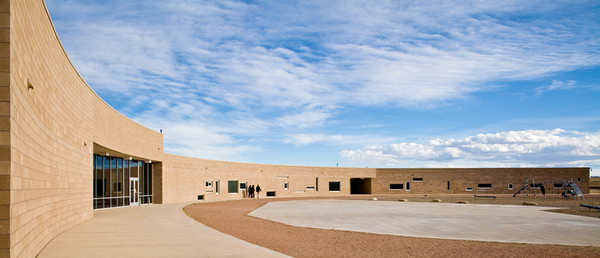
The above image is of the curved west elevation of the Discovery Canyon school in Colorado Springs by Antoine Predock. I could have shot this with a very wide lens and cropped it to this format, but that would entail throwing away almost half the file. By stitching two frames together, I was able to produce a much higher quality file. FWIW, I find the stitching program in Photoshop CS4 to be sufficient for these kinds of simple stitches. The falloff in the outer top corners from the shift is easily correctable unless you really racked the lens out to its limits both directions, which I don't recommend. The image below is from 3 vertical shifts. It a school building by RMKM Architects in Albuquerque. Stitching is a regular part of my practice.


Monday, April 13, 2009

Inexpensive 4x5 Digital Solutions??

From David, an accomplished artist, whose subject matter includes architectural details:

I do optical C prints [from color negatives] to 40x50 but because of publications I am scanning now as well. I am reaching the "digital divide", was wondering if you have any thoughts on (affordable) digital capture at low light levels that would reach 4x5 quality?

An oxymoron at best, inexpensive 4x5 digital solutions? Basically the backs and the cameras are very expensive so lets look at how to utilize your existing 4x5 view camera and lenses. A couple of options come to mind. "Affordable digital capture of 4x5 quality" is a tall order. From what I know of David's work the subject matter is rather static. That makes both stitching and scan backs an alternative. I would look at refurbished or used Betterlight scan backs (which is slightly smaller in capture area than 4x5 film) used in a normal VC. I have played with one and have a friend who owns one and the files are impressive even with non-didgital lenses. The more expensive ones far exceed anything you can get from scanned 4x5. According to an email from the sales manager:

Kirk, All of our systems out shoot 4x5… provide higher information densities and
greater accuracy than could ever be expected from 4x5 Ektachrome films.
Our most popular and versatile model is our Super 6K-HS which sells for
$14,995.00 but right now I have two other models that may serve your needs.
We have one 4000-HS and a number of 6000E-HS’s available, all for $9,995.00.
The differences between these two systems is:
- the resolution, 3750 x 5000 vs. 6000 x 8000
- the sensitivity, ISO 200 vs. ISO 100
So the trade off for the same price is greater resolution vs greater
sensitivity. If your shooting mostly in standard daylight situations the
lower ISO shouldn't be a bother, but for a successful commercial photography
the right choice would be a Super 6K-HS.

Then there is the Quad Stitch Back for use with some very solid view cameras. I have no personal experience with these. With four stitches even from a refurbished 22MP back you can get 4x5 quality (requires true digital lenses for optimum performance).


See also: From 4x5 to DSLR
and Medium Format Digital
 
Add to Technorati Favorites