Thursday, April 29, 2010

Thoughts on diffraction.....

What is it? Basically in architectural photography we use small apertures for maximum depth of field. But if you stop down to an aperture smaller than optimum a problem referred to as diffraction crops up to compromise the overall sharpness of the film/file. It is easy to see this effect with a DSLR by doing a series of equivalent exposures of say a textured wall-stopping down the lens a full stop each time while slowing down the shutter speed a full stop each time to give an equivalent exposure. At a given smaller aperture the sharpness will ever so slightly start to decline-usually with DSLR lenses around f11-and get progressively worse as you stop down further. What does this mean with architecture? Usually I want maximum depth of field (depth of focus) so I am always stopping down. But at what point does diffraction become objectionable? By my tests (for example with a 24 T/S II) diffraction starts to hint at an aperture smaller than f11. Remember a smaller aperture is a larger number right? F8 is a larger aperture than f22. But back to my 24mm test, f11 does not give me enough depth of field most of the time especially if I have a close foreground and a building in the background filling the frame (a near/far composition which amounts to allot of my shots). My compromise? F13 (unless I know the images are going to only be used small I may go to f16 or even f22 rarely). Note a touch more sharpening can hide a touch of diffraction. This from the LargeFormat Forum may help explain this:


DIFFRACTION
A beam of light passing through a circular aperture spreads out a little, a phenomenon known as diffraction. Diffraction is a physical phenomena which is inescapable. The smaller the aperture, the more the spreading. For photographic lenses, diffraction depends only on the f-number. Strictly speaking, diffraction is a function of aperture size or the physical size of the hole and that is how it would be defined in a physics textbook. Which means that the larger area aperture in a 300mm lens at f/16 (as compared to a 50mm lens at f/16) should provide lower diffraction. However, diffraction patterns are angular patterns and as such are dependent on how far from the aperture you place the screen used to view it also. In photography, the aperture is at the optical center of the lens and the screen is (for infinity focus) one focal length away. The physical size of the diffraction blur is then the focal length divided by the apparent size of the aperture i.e., the definition of the f stop. Thus, in photography, diffraction is only a function of f stop and not a function of the focal length. In simpler terms, the larger aperture of the 300mm lens does offer lesser diffraction at the diaphragm (i.e., less bending around the diaphragm) but since the light now has a longer distance to travel (as compared to the 50mm lens), the smaller bending still results in a fair bit of blur at the viewing screen. N Dhananjay

On digital cameras it is a little more complex, because you have to factor in weird things like pixel pitch. If you are a techy read this. If you do their calculations on my lens/camera example above, you see that at f11 I am not diffraction limited but at f13 it is just starting-which confirms my field tests. Otherwise if you are just a shooter like me just do the simple testing I suggested and pick your optimum aperture for the lenses and scenes you like to photograph. Remember my POV. To make a DSLR do first class professional AP. You must maximize at every step the quality of the image. In this case that means getting the smallest aperture possible without inducing too much diffraction.

Ian raised an interesting point:

Hi Kirk. Firstly, thanks for taking the time to write this blog. I appreciate the effort in communicating your insights, techniques and link sharing. In response to this post, is there a possible part 2 in which you share how using a t/s, angled down 8 degrees, helps give the illusion of greater depth of field? I'm guessing on the degrees, as I do not as yet own a t/s. Could a statement be made such as, 'if you're stuck at f/13 due to diffraction but angle your t/s by this amount, it'll look like you're at f/22' or some such thing?
Thank you sir,
Ian.

Excellent point Ian. It raises the issue of tilts which can effectively give an image an exaggerated DoF. Frankly I don't use much tilt on architecture (I use it allot on landscape), because I work fast and tilts can get you into allot of trouble. Basically tilts change the plane of focus from parallel to the wall or building to a plane slanted (if you tilt forward) from the foreground to the top of the background. This leaves the bottom of buildings potentially waaaaaay out of focus and your DoF may not pull it back into focus. So use tilt verrry sparingly like no more than 1/8 to 3/16 of an inch forward tilt and refocus on the foreground a bit away from camera position and the building a bit below the top and look CLOSELY at the bottom of the building and see if it is way to far out of focus-use your Live View focusing magnifier to take a good look and see if you are in the ballpark. You may need more or less tilt. Remember to keep the building straight-you still keep the camera level as you tilt the lens forward. I strongly suggest practicing this some and looking at the files blown up on your monitor to really see what is OK in terms of tilt and aperture and DoF.
Wednesday, April 28, 2010

New Lens Correction tool-Photoshop CS5

There is an extraordinary new tool in the new Adobe products: Lens Correction. The canned profiles will NOT help with issues related to Tilt/Shift lenses except in a generic sense (no profiles are supplied, but you may be able to create some that would be helpful at different degrees of shift say), because the problems occur differently at each shift or tilt point ie there are an infinite number of issues and solutions per lens. However, the new lenses are so good that they have few problems like barrel or mustache distortion and what problems existed were easy to correct in CS4 Distort (which I prefer over the old Lens Correction) and should be easier still in the new CS5 Lens Correction.

Adobe® Lens Profile Creator

The new 24mm T/S II is dramatically superior to the old one and with the 1.5 tele-extender makes a great 35mmT/S too. What did I do with the old one? I donated it and my Olympus 35mmPC to the school I teach at, The School of the Art Institute of Chicago, so my students have access to functional lenses for architecture.

Tuesday, April 27, 2010

There's toning and then there is "toning"

From Reuters.........digital steroids anyone? Don't get carried away with the enhancements. As someone said on the LF Forum...just because you can doesn't mean you should.

http://thestar.blogs.com/photoblog/2...m-dilemma.html
__________________
Thanks,
Kirk

Wednesday, April 21, 2010

Fun and Games......its not all work!


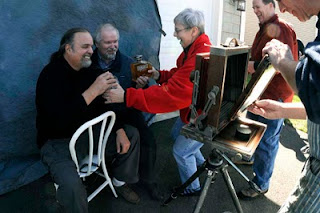
Fun and games during Bill Schwab's Wet Plate workshop at the New England Large Format Photography Collective conference. That's me and Paul Paletti (of the Paul Paletti Gallery in Louisville) posing with his booze (Paul manufactures a liquor named Dumonte), Marie staging, Steve Sherman enjoying it all and Bill Schwab behind the Deardorf. Photo by Robert Seto.

Bill Schwab is teaching another Wet Plate workshop at Project Baso the first part of May.

See also these posts below: Schwab and Sherman.

How To-Architectural Photograhy Books.....

I like the Norman McGrath book, "Photographing Buildings Inside and Out" and Julius Shulman's book  "Photographing Architecture and Interiors". They are probably the best out there for view cameras and film. They have allot of good tips and insights. But speaking as someone who has taught this since the mid 80s, There is no book out there that can even begin to serve as a introductory textbook. The subject is just too complicated. IMO one first needs basic VC (or digital skills with T/S lenses and Photoshop) skills and then lots of practice on exteriors before attempting interiors and the complexities of lighting. IE get competent with the camera on exteriors and then tackle interior lighting. There is no book out there, that I have seen, that logically approaches the subject in a structured manner. I have been asked to review a few new books on my blog, but have yet to see a new one that deserves the effort. Maybe I should write it, but frankly I don't have the time. Any suggestions for books I may not have seen?

Wednesday, April 14, 2010

The Dwell "Look" or Unhappy Hipsters and the Deadpan Aesthetic.

Read this thoughtful blog post By Tim Atherton of the Blog "Musings" on the Dwell Aesthetic. Insightful and thought provoking.

On a mildly serious note, over the last few years it's been interesting to note how the "deadpan" aesthetic in photography - applied to both people and places - has eventually made its way from the edges through to illustration and advertising. From the New Topographics by way of New Colour and the "Dusseldorf School" etc. it has been showing up more and more often in ads and magazine articles. Nowhere is this more so than in the case of architecture, design and "lifestyle" magazines.

See:
http://photo-muse.blogspot.com/2010/03/unhappy-hipsters-and-deadpan-aesthic.html

I know that some of my regular magazine clients are wanting to emulate that style and I have made some vague attempts. Examples to come.

Tuesday, April 13, 2010

Stock sales booming.......?

Just a note to the faithful.......one side effect of the recession seems to be increased stock image sales. I guess maybe that is cheaper than the alternative of hiring another photographer to re-shoot a project. Since December 15 of last year, my stock sales have gone through the roof. In the last 3-4 months I sold more stock than in the previous 2 years combined. Your thoughts?

Video and Architecture and a Canon 5DII

At the request of a magazine client who I shoot stills for, I am getting into shooting video for their website. This is another way to diversify my income in these difficult times. Video is something I had always wanted to get into so this is a good inducement. I have directed videos before, working with the skills and equipment of a professional crew before, but done no shooting on my own.

Shooting video, even D&D for basic usage like websites with a 5DII, requires some additional tools. At a minimum I will need a fluid head for panning, and working knowledge of a decent editing program like Final Cut Pro or Adobe Premier. I'm sure as I get into this I will find more weaknesses in my equipment and computer skills. I will periodically give updates as this new endeavor progresses.

If someone thinks that trying to shoot professional video with a 5DII must be a joke..........the final episode of HOUSE (see Gismodo) is being shot with a 5DII!


Anyone out there been down this road, shooting video of architecture?

Monday, April 12, 2010

Bill Schwab's Vision

While at the New England Large Format Photography Collective symposium last week where I was presenting on my work and leading a shooting session to the old Harford City Hall (see below), I had the opportunity to meet (and be photographed in Wet Plate Collodion!) an artist who work I have loooong admired, Bill Schwab of Detroit. Bill has IMO one of the more elegantly personal visions around and produces prints of startling simplicity, elegance and beauty. Though not architectural photography by and large, he's mainly a landscape photograher-anyone can enjoy and learn from his unique vision. Bill Schwab Photographs

A fine portrait of me in Wet Plate Collodion he did while at the conference. 
FYI, Wet Plate Collodion is an antique photographic process invented in about 1850.

Masters at Work-Steve Sherman's Hartford City Hall Portfolio

I spent last weekend at a wonderful event, The New England Large Format Photography Collective annual get together in Hartford Connecticut, a truly great bunch of artists and their families. On Sunday I led a shooting session in the old Hartford City Hall, a fine example of turn of the century grand municipal architecture. No one has ever photographed this structure better than my host, the very gifted Steve Sherman. See his ongoing portfolio at: Steve Sherman's Hartford City Hall Portfolio. His superb images capture the essence of this historic building in all its classic elegance. See all his work at the main site: Steve Sherman Photography.
 
Add to Technorati Favorites