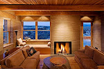

Photographers in my area have often remarked over the years that I get more than my fair share of magazine covers. It is true that I have had allot, over 120 in the last thirty years. There is no real trick to this. You simply have to shoot verticals with magazine cover needs in mind. This is something I try to do on every shoot, even when my client is not a magazine-hoping that when the images sell as stock to a magazine that I will raise my chances of getting a cover that way. I have had crops from horizontal images make it to covers but it is rare. When shooting DSLR smaller than 21MP, cropped horizontals can really stretch the native resolution of the original image. As a result some art directors are reluctant to consider this alternative. It is simply better to shoot some strong verticals. Bear in mind that the aspect ratio of most covers is more squarish than a FF DSLR rectangle and that some cropping will occur anyway. Keep this in mind when composing for masthead placement too.

First and foremost a magazine needs a striking image that will cry out on a newstand. Secondly, a magazine needs room for a masthead at the top that is not to busy and third they need areas that are not too busy in the main area to drop in enticement content titles. Some magazines, though certainly not all, prefer that the composition lead the eye towards the right and the open pages rather than the left and the binding. Simple?

For more of my covers see:
KGP Covers


No comments:
Post a Comment