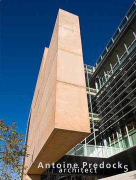
There are two great new exhibits of Antoine Predock's work at the University of New Mexico. They are well worth seeing. Last night my wife and I were invited to a private recption there. It was great-but not what I expected. This was a special "thank you" reception by Predock and the book's author Christopher Mead to all those who contributed to the new book and exhibit. Predock was very gracious to all of us, mentioning all by name and their contributions. He is a world class talent and a real gentleman. I was honored to be there. The book is his 14th monograth.
ROAD CUT: THE ARCHITECTURE OF ANTOINE PREDOCK
Friday, January 28, 2011


Wednesday, January 26, 2011
AP thread on LuLa
There is an interesting new thread on Architectural Photography on Luminous Landscape. Many of the usual suspects are contributing. See:
What Kit do you like and why?
What Kit do you like and why?
Tuesday, January 18, 2011
Odd Jobs
"Odd Jobs" refers to jobs that have some unusual aspect to them that I have not encountered before. This is a great example. By and large in AP we avoid seasonal decorations like the plague. Why? Because a)they limit the stock use of the images to seasonally themed publications (i.e. Christmas issue of a shelter magazine); b)this kind of decor is unrelated to the structure or interior design.
This shoot is an exception. The subject IS the Christmas decor. The client was Red Shovel, the designer and installer of the decor and the location is Sandia Casino and Resort in Albuquerque.
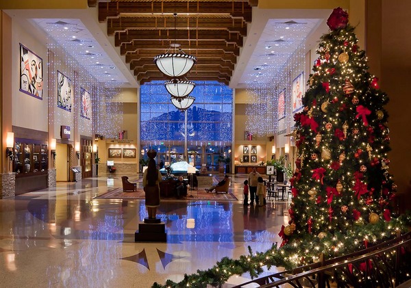
The challenges? Making sure the XMAS lights do not blow out rendering them white rather than their intrinsic color. How? No use of HDR, but instead careful timing of the shot paying attention to the depth of the exterior color, use of the 5DII HighLight Priority setting and judicious use of the Recovery slider in Lightroom (or Adobe Camera Raw). Why no HDR? Because of registration issues. I could not control the air handling system so the the long light strands were moving as in a gentle breeze.
This shoot is an exception. The subject IS the Christmas decor. The client was Red Shovel, the designer and installer of the decor and the location is Sandia Casino and Resort in Albuquerque.
The challenges? Making sure the XMAS lights do not blow out rendering them white rather than their intrinsic color. How? No use of HDR, but instead careful timing of the shot paying attention to the depth of the exterior color, use of the 5DII HighLight Priority setting and judicious use of the Recovery slider in Lightroom (or Adobe Camera Raw). Why no HDR? Because of registration issues. I could not control the air handling system so the the long light strands were moving as in a gentle breeze.
Friday, November 12, 2010
Bill Schwab print offer.....

http://www.billschwab.com/webseries/special_offer/november_2010_offer.html
Tuesday, November 9, 2010
Why Are My Prints Too Dark?
If you print digitally and struggle to get accurate soft-proofing (who doesn't struggle with this?)........this article from LuLa by Andrew Rodney is absolutely fundamental.
Why Are My Prints Too Dark?
Why Are My Prints Too Dark?
AIA Albuquerque Competition
Wow! This year I worked on eight of the fourteen winners entries of the AIA Albuquerque Design Awards. It was very competitive this year with 56 strong entries. Congratulations to all these very talented designers!
Honor Awards
Honor Awards
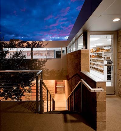
Casa Guadalupe Franciscan Friary
Architect: Calott + Gifford Architecture / Urban Design
Owner: Province of Our Lady of Guadalupe Franciscan Friars
Contractor: Enterprise Builders
Architect: Calott + Gifford Architecture / Urban Design
Owner: Province of Our Lady of Guadalupe Franciscan Friars
Contractor: Enterprise Builders
Valle Vista Elementary School
Architect: Garrett Smith, Ltd.
Owner: Albuquerque Public Schools
Contractor: Cheyenne Builders
Architect: Garrett Smith, Ltd.
Owner: Albuquerque Public Schools
Contractor: Cheyenne Builders
Merit Awards
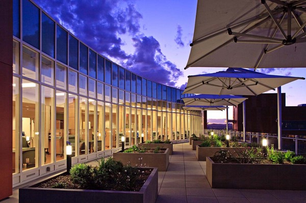
University of New Mexico Cancer Research & Treatment Center II
Architect: Rohde May Keller McNamara Architecture, P.C. & VOA Associates Inc.
Owner: University of New Mexico
Contractor: Flintco Inc. General Contractors
Architect: Rohde May Keller McNamara Architecture, P.C. & VOA Associates Inc.
Owner: University of New Mexico
Contractor: Flintco Inc. General Contractors
Citation Awards
Aperture Center
Architect: Jon Anderson Architecture (Executive)
and Antoine Predock Architect PC (Design)
Owner: Forest City Covington
Contractor: Klinger Constructors, LLC
nex+Gen Academy
Architect: Dekker/Perich/Sabatini
Owner: Albuquerque Public Schools
Contractor: AIC General Contractor
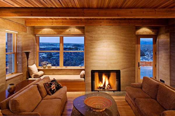
Sage House
Architect: Jon Anderson Architecture (Executive)
and Antoine Predock Architect PC (Design)
Owner: Mike and Vee Yacinno
Contractor: Ian Forsberg - General Contractor
Aperture Center
Architect: Jon Anderson Architecture (Executive)
and Antoine Predock Architect PC (Design)
Owner: Forest City Covington
Contractor: Klinger Constructors, LLC
nex+Gen Academy
Architect: Dekker/Perich/Sabatini
Owner: Albuquerque Public Schools
Contractor: AIC General Contractor
Sage House
Architect: Jon Anderson Architecture (Executive)
and Antoine Predock Architect PC (Design)
Owner: Mike and Vee Yacinno
Contractor: Ian Forsberg - General Contractor
Placita House
Architect: Jon Anderson Architecture
Owner: Juno and Julia Raby
Contractor: Sunbelt Properties - General Contractor
Downtown@700 2nd
Architect: Dekker/Perich/Sabatini
in collaboration with Garrett Smith, Ltd.
Owner: Supportive Housing Coalition of New Mexico
Contractor: Global Structures
Architect: Jon Anderson Architecture
Owner: Juno and Julia Raby
Contractor: Sunbelt Properties - General Contractor
Downtown@700 2nd
Architect: Dekker/Perich/Sabatini
in collaboration with Garrett Smith, Ltd.
Owner: Supportive Housing Coalition of New Mexico
Contractor: Global Structures
Friday, November 5, 2010
Digital Tools for Architectural Photographers
Interesting article by Richard Sexton in LuLa. Richard is a widely published architectural photographer working out of the South. The article is on the tools of the trade. Note the conclusions.
DIGITAL TOOLS FOR ARCHITECTURAL PHOTOGRAPHERS
DIGITAL TOOLS FOR ARCHITECTURAL PHOTOGRAPHERS
Thursday, November 4, 2010
Cropping Architectural Images for Clients
Thanks for the inquirey-good question. First off to maximize image quality, I try to shoot full frame in the field. When I do crop it is to improve image impact and I don't worry really about maintaining the native Aspect Ratio of the camera. So when I deliver a set of files the majority are in the native AR and a few are whatever. Those that are not are mostly stitches of some sort. Clients have never said boo about it. The only time I get a request for a specific AS is with magazine covers or from architects who have existing framed prints in their office that they want to match, but that has been rare."Hello Kirk, I have been reading your site and learning for quite a while. Your eye for images is stunning. I have a question about cropping. I stay within the camera original aspect ratio when I deliver images for clients, unless they provide specifics. I have a start up photography business and I do residential and commercial. I hope to eventually shoot major architectural jobs (I have a longggggg way to go) and am learning all I can. Presently, I'm using a crop sensor Canon DSLR with good results for the clients I have served. I am going full frame with a Canon 5D II set-up in December. What ratio due you normally crop to (hopefully I'm asking the right question here)? Do you stay within your cameras native ratio or do you crop to desired look. I have had several images that I feel would be improved with "free" cropping (no set aspect ratio, just drag box until I get desired effect). Any cropping advice would be appreciated. Much info on cropping, but not much on the delivery side. Keep up the good work"
The only time cropping to a specific AR becomes absolutely critical for me is when I am shooting assigned magazine covers. There has to be room made for the masthead, leads etc. Since all magazines are not the same AS it requires some legwork to figure that out ahead of time. For some of my clients like Su Casa (and), which I have mentioned before here, we always shoot tethered, bring the potential cover up in PS and layer it with the magazines cover template to make sure everything fits. We have learned to do this because of AR issues in the past.
Sunday, October 10, 2010
Fond memories of former assistants......
Fond memories of former assistants.......a couple of days ago I received this message from a young man who worked for me briefly some years ago.....really sweet.
It really makes me happy to hear comments like this. To have a positive impact on someone's life makes all the other successes seem somewhat trivial.
Hello Kirk, Recently I have been thinking of how I got to where I am at today and a key part of my life was working for you. At that time I was heading in the direction of so many high school dropouts, but working for you gave me a sense of purpose and enjoyment and really was a spring board in getting my first big city photo gig. Just overall a very positive experience.
So thank you for that opportunity and congratulations on being a grandpa and all the other good stuff going on with you
It really makes me happy to hear comments like this. To have a positive impact on someone's life makes all the other successes seem somewhat trivial.
Sunday, October 3, 2010
Composing Architectural Images
In the last thread Tonnes asked:

This is a detail of a rail in front, against a structural crossbeam, against the window frames with a sage covered hill in the background.
In a couple of days I will post this images predecessor which I carefully framed, exposed and then packed up the camera to move on to the next area. But I couldn't walk away from the scene-it felt unfinished-until I did the image above. See you soon!
By the way Kirk, your image is beautifully composed. It would be great to hear more from you on the subject of composition.Thanks for that comment Tonnes. I have to say that I have always had difficulty discussing composition. To me there are no rules. It is almost "when it feels right-its right". I know how lame that sounds to allot of people and it is not an intentional cop-out, but that is how I work. Here is an example from that same Reno shoot-one of my favorite detail shots of all time.

This is a detail of a rail in front, against a structural crossbeam, against the window frames with a sage covered hill in the background.
In a couple of days I will post this images predecessor which I carefully framed, exposed and then packed up the camera to move on to the next area. But I couldn't walk away from the scene-it felt unfinished-until I did the image above. See you soon!
Tuesday, September 28, 2010
A decent HDR program finally?
Architecture is the crucible of HDR programs. The hard edges between light and dark areas generate halos etc. Up to this point I ALMOST ALWAYS found it better to light the site artificially rather than try and make an HDR image look decent. Don't think I didn't try. I own or have tried most if not all the HDR programs out there and largely given up in frustration.
Then came Lightroom 3 and the Enfuse Plugin. I have much testing to do, but my initial tests show great potential. The test below (bottom) is the DEFAULT settings from a 2 stop exposure bracket, straight from the DNGs in LR3. The image on the top is the unaltered "middle" exposure. Hmmmm........


Architecture by Dekker Perich Sabatini-Albuquerque, Las Vegas and Amarillo. The University of Nevada Reno Center for Molecular Medicine in Reno Nevada.
Now you might say that this could be done by boosting the Recovery and Fill Light sliders and.......yes you could and I did, but you concurrently generate pattern noise in the shadows you boost. Enfuse's method of sampling the shadows from the brightest exposure creates bright shadows with zero noise (this is typical of all the HDR programs I have tested).
This HDR'd result tries to more closely mimic the eyes experience of the scene where the eye dilates as it moves from shadowed areas to the windows. If you overdue it, bringing the window light down further, the lack of brightness in the windows seems unnatural resulting in that overdone HDR effect.
Then came Lightroom 3 and the Enfuse Plugin. I have much testing to do, but my initial tests show great potential. The test below (bottom) is the DEFAULT settings from a 2 stop exposure bracket, straight from the DNGs in LR3. The image on the top is the unaltered "middle" exposure. Hmmmm........
Architecture by Dekker Perich Sabatini-Albuquerque, Las Vegas and Amarillo. The University of Nevada Reno Center for Molecular Medicine in Reno Nevada.
Now you might say that this could be done by boosting the Recovery and Fill Light sliders and.......yes you could and I did, but you concurrently generate pattern noise in the shadows you boost. Enfuse's method of sampling the shadows from the brightest exposure creates bright shadows with zero noise (this is typical of all the HDR programs I have tested).
This HDR'd result tries to more closely mimic the eyes experience of the scene where the eye dilates as it moves from shadowed areas to the windows. If you overdue it, bringing the window light down further, the lack of brightness in the windows seems unnatural resulting in that overdone HDR effect.
Sunday, September 19, 2010
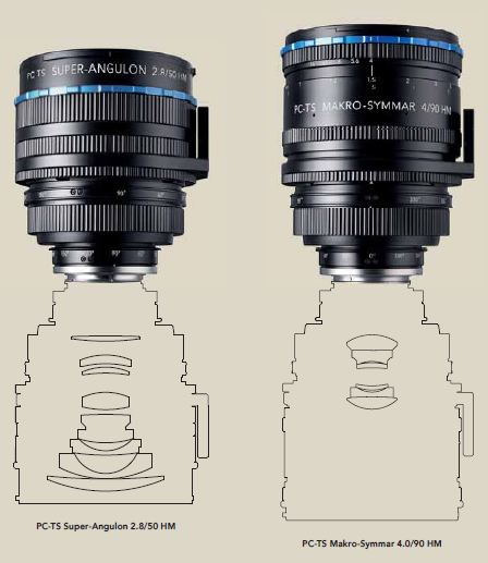
Have you been waiting for the Canon upgrades to the 90 and 45 T/S lenses? Lenses on par with the new 24T/S II and 17? Schneider jumps in with some mighty contenders!
Schneider T/S
According to recent reports from Photokina, these lenses have manual apertures, which at this price point is a real drag.

Schneider T/S
According to recent reports from Photokina, these lenses have manual apertures, which at this price point is a real drag.
Saturday, September 18, 2010
Scanning for Fine Art Images
Imacon "Virtual Drum Scan" vs. Epson 750 home scan vs. Aztec Premium Drum Scan
Frankly most of my serious efforts with scanners and scans revolve around my B&W work. Of course I have, prior to digital, had thousands of my commercial color transparencies scanned for magazines, books, posters etc. but I was rarely involved in that. For a couple of years, just prior to digital, I did do allot of my own scanning for commercial publication because I was behind the times and everyone just wanted files. I never found that a home scanner like an Epson 750 (in my hands) could deliver what a commercial drum scan could deliver on transparencies for publication. They suffered in the shadow areas, highlight separation, color fidelity etc. I never had any complaints from clients, but I could see the difference.
It is certainly true IME that the major differences of home flatbeds and pro drum scans lies in resolution and in the renderings of the extremes of the tonal range. My 750 cannot pull detail out of deep shadows anywhere close to a good drum scan and I believe at the other end of the scale in the highlights that there is some flaring that takes place in home flatbeds that obscures fine detail in dense highlights.
I believe this is part of the key to maximizing tonal control from the Epson scanners. Shoot and develop for the limitations of the scanner. With a drum scan I just shoot normally using basic Zone System controls, but to maximize a scan on an Epson I would place the low values higher and develop the highlights lower.
BTW, I visited the printing service (Pat Carr-Carr Imaging-a true master) I use for large digital prints yesterday, who was working on a print of mine that I had never printed in silver or ink larger than 16x20 before (4x5 TRI-X in HC-110). I have never owned a printer that would print over 17" wide. This is a print 24x33-actually the largest art print I have ever made and is for an upcoming museum show. It was scanned by me on a well maintained Imacon at SAIC and looked superb at that size. The grain (or grain clumping I don't suppose that an Imacon can actually resolve grain) was sharp and tight and looked great even on close inspection with my reading glasses, requiring no additional sharpening than the original Imacon capture sharpening (I don't remember the setting). This was never a "look" that I could get on large prints with my Epson. As a backup I had Lenny Eiger, Eiger Studios, do a drum scan of the same image in case it didn't hold up at that size. Lenny's scan pulled more deep shadow detail out of the negative, but I didn't need it-not a wasted expense anyway-I am archiving quality drum scans of all my best images from the past 30 years.
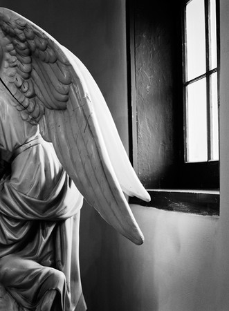
I know Lenny's drum scan has more deep shadow detail than the Imacon, but I tend to print this pretty deep anyway. There is a fair amount of work in the file and with a tight deadline looming, I was not wanting to start over with a new scan unless I had to. But in terms of resolution the Imacon could handle this size and on this image the tones were fine too.
Frankly most of my serious efforts with scanners and scans revolve around my B&W work. Of course I have, prior to digital, had thousands of my commercial color transparencies scanned for magazines, books, posters etc. but I was rarely involved in that. For a couple of years, just prior to digital, I did do allot of my own scanning for commercial publication because I was behind the times and everyone just wanted files. I never found that a home scanner like an Epson 750 (in my hands) could deliver what a commercial drum scan could deliver on transparencies for publication. They suffered in the shadow areas, highlight separation, color fidelity etc. I never had any complaints from clients, but I could see the difference.
It is certainly true IME that the major differences of home flatbeds and pro drum scans lies in resolution and in the renderings of the extremes of the tonal range. My 750 cannot pull detail out of deep shadows anywhere close to a good drum scan and I believe at the other end of the scale in the highlights that there is some flaring that takes place in home flatbeds that obscures fine detail in dense highlights.
Quote:
| And if you take that into account when exposing and developing your film, you should be able to get as much shadow detail as you'd like in your images, even using an Epson scan. Peter De Smidt |
BTW, I visited the printing service (Pat Carr-Carr Imaging-a true master) I use for large digital prints yesterday, who was working on a print of mine that I had never printed in silver or ink larger than 16x20 before (4x5 TRI-X in HC-110). I have never owned a printer that would print over 17" wide. This is a print 24x33-actually the largest art print I have ever made and is for an upcoming museum show. It was scanned by me on a well maintained Imacon at SAIC and looked superb at that size. The grain (or grain clumping I don't suppose that an Imacon can actually resolve grain) was sharp and tight and looked great even on close inspection with my reading glasses, requiring no additional sharpening than the original Imacon capture sharpening (I don't remember the setting). This was never a "look" that I could get on large prints with my Epson. As a backup I had Lenny Eiger, Eiger Studios, do a drum scan of the same image in case it didn't hold up at that size. Lenny's scan pulled more deep shadow detail out of the negative, but I didn't need it-not a wasted expense anyway-I am archiving quality drum scans of all my best images from the past 30 years.
I know Lenny's drum scan has more deep shadow detail than the Imacon, but I tend to print this pretty deep anyway. There is a fair amount of work in the file and with a tight deadline looming, I was not wanting to start over with a new scan unless I had to. But in terms of resolution the Imacon could handle this size and on this image the tones were fine too.
Friday, September 3, 2010
The Dwell Effect

I have been discussing, off and on, the impact on our business of the popular magazine Dwell. It is not an abstract discussion as myself and many photographers I know have been asked to imitate that "Dwell Look". Well here is my latest, an art directed example for one of my favorite locally based national magazines.
The original a flat stitch of one of the reject poses with the camera in a horizontal position. The stitch was requested to insure that they had enough real estate to work from. There was great natural light that just needed to be slightly boosted and the ambient color to be cleaned up. Two lights were used, a fill bounced off the white wall behind me and one in the kitchen set slightly brighter to pull the eye in. When doing these kind of stitches, it is only necessary to shoot the left side once, but the right side with the home owner multiple times, in different poses, and then stitch the selected right side of the woman with the previously shot left side. This was a difficult stitch as there was not much detail in the overlap area for the program, PS CS4 to find reference points. I ended up manually stitching these. The right example has been cropped in some already at this point. The merge area is between the chairs.
Unfortunately I had to manually stitch a number of these before the art director decided which she wanted. Left-the final published cover. Right-one of the rejected poses.
The most recent cover in the same vein.


Subscribe to:
Posts (Atom)


 Posts
Posts

