Monday, April 27, 2009

Sacred Places Poster

Over the years, some of the most satisfying work I do is for historic preservation. Sometimes this is in the form of documenting threatened structures, sometimes a HABS report (Historic American Building Survey) and sometimes it is simply contributing my work to benefit historic preservation organizations and projects. In this situation it is the annual poster for New Mexico Historic Preservation Month of the New Mexico Heritage Preservation Division, Office of Cultural Affairs. The image they selected for the Sacred Places theme is of the Upper Morada in Abiquiu, just up the hill from Georgia O'Keefe's house. The image is from 4x5 Tri-X Professional pack film developed in HC 110, "The Way of the Cross", Upper Morada, Abiquiu, New Mexico, 1988. This was printed with a very strong duotone colorization from a monotone print file, designed by Tom Drake.


I will be signing these at the Heritage Preservation Awards Ceremony this Saturday at the Santa Fe Convention Center 2-5pm.

Interesting question about aesthetics and historic preservation in New Mexico from a duplicate post at another forum.

"Kirk, Splendid stuff. Anyone ever figure out why they put that gas meter on the side of the church at Ranches de Taos? I, along with millions of others, have pictures of that church going back to the early sixties. It never ceases to amaze me that they did that. It's hardly what I'd call historic preservation."

FWIW, I used to be a member of a committee for historic preservation with the Archdiocese of Santa Fe. The Ranchos de Taos church was within our jurisdiction. As the church restoration and maintenance is done by local volunteers with donations, the committee was not likely to intervene unless something unsafe was being done. The locals' priority was always very pragmatic. I felt like I was the sole person concerned with aesthetics (for obvious reasons) and frankly aesthetics were a very low priority for the committee as a whole considering the magnitude of the structural issues etc. A few classic churches collapsed in the 70's and 80's. There were some 800 historic churches in the A of Santa Fe and resources were very low and spread very thin.
"If you look at Ansel's 1929 shot you can see how beautiful this building was before it was vandalized."
I wouldn't call it vandalized. It was simple pragmatism. The gas line runs straight from the street to that wall. The west buttress would have been the absolute nearest point but the wall at the base of the buttress is like 10' thick. So the next closest is the wall to either side of the west buttress. The buttress itself was not built for aesthetic purposes. It was simply to keep the back of the church from collapsing. To them it solved a problem. To us the buttress is pure sculpture. Pragmatic architecture is sometimes exquisitely simple and beautiful like the buttress and sometimes it is awful like the gas meter. The beauty of the back of the building is our preoccupation. Their preoccupation is the structural integrity of the church. Who has the higher purpose? I would argue that they do.

Wednesday, April 22, 2009

The Art of Architectural Photography: Pueblo Bonito Ruins


I was working on a file of an art print for a client today and I thought the transformation would be instructive. The top is the original scan and the bottom is the finished file. "The Memory of Form", Pueblo Bonito, New Mexico 1984 (shot on 4x5 Tri-X with a #15 orange filter, developed in HC 110, scanned on an Imacon 949).

The manipulations involved are to make the print represent my feelings about the scene beyond what the scene looked like. The manipulations add drama, depth and balance to the print.

For the final print the sky has been darkened and contrast added with a double softlight gradient which has been sculpted in the layer mask to fit around the escapement. The tone and value of the ruins in the foreground have been lowered with a curve adjustment layer (sculpted in the layer mask to fit the top edge of the ruins) to separate it from the canyon wall. The bottom right hand corner has been burned in with an art history brush (linear burn mode) from a snapshot. Some additional local enhancement of the tones in the clouds and sandstone were done in this same manner. The final file has 6 adjustment layers.

For years I produced a similar traditional silver print by careful burning and dodging on graded papers like Zone VI Brilliant (see below). But with digital printing I can get the midtone contrast I like while preserving better shadow detail. Thisprint will be available this fall at the Albuquerque Museum special 2009 Minatures Show.
.

Tuesday, April 21, 2009

Pet Peeves

"Your photograph looks like a painting........."

However well intentioned, statements like this are derogatory to old school photographers like myself who suffered through the days when photography was not broadly accepted as a fine art medium (I was around for the tail end of this in the late 60's).

Photographers in the first half of the century struggled long and hard to free itself from the perception that it was just the poor stepchild of painting and develop a uniquely photographic aesthetic. Remember F/64? Suggesting that imitating painting contains some higher aesthetic purpose for photographers is a very antiquated and long ago discarded idea.

Inexpensive 4x5 Digital Solutions?? A follow up.

David wrote:

Thanks so much for taking the time to respond to my inquiry.
I have looked into the Betterlight backs but unfortunately they are pretty limited in terms of exposure times, so won't really suit the long time exposures (up to 30 minutes) of my current project. However it is good to hear the quality is good so they are certainly a possibility for future projects. The stitching approach is certainly an alternative that I will keep in mind - there are even some fairly inexpensive VC adaptors for Canon DSLRs which might make it affordable. And then a simple alternative with the DSLR would be a T/S lens which would allow stitching two frames together - have you ever done this?

David, Yes I do 2x stitches with a shift lens weekly for various commercial and personal projects. BUT that is not going to get you the 4x5 quality you are talking about. For example the native resolution of a 21MP 5DII at 300 DPI is 12.48x18.72". Double that (less overlap) for a 2X stitch. I guessing you would need a 4x stitch to approach the quality you need at the size you need.

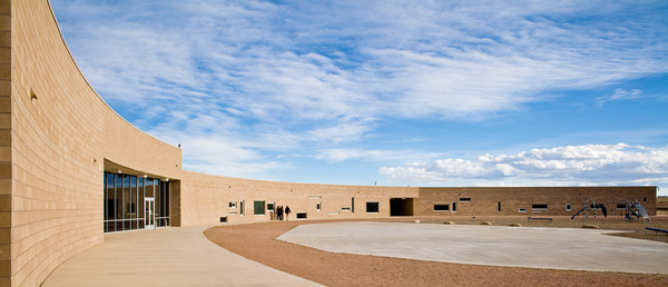
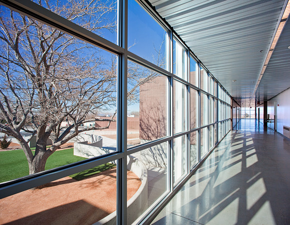
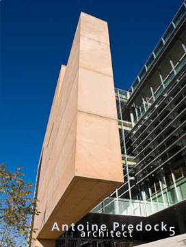
The above image is of the curved west elevation of the Discovery Canyon school in Colorado Springs by Antoine Predock. I could have shot this with a very wide lens and cropped it to this format, but that would entail throwing away almost half the file. By stitching two frames together, I was able to produce a much higher quality file. FWIW, I find the stitching program in Photoshop CS4 to be sufficient for these kinds of simple stitches. The falloff in the outer top corners from the shift is easily correctable unless you really racked the lens out to its limits both directions, which I don't recommend. The image below is from 3 vertical shifts. It a school building by RMKM Architects in Albuquerque. Stitching is a regular part of my practice.


Monday, April 13, 2009

Inexpensive 4x5 Digital Solutions??

From David, an accomplished artist, whose subject matter includes architectural details:

I do optical C prints [from color negatives] to 40x50 but because of publications I am scanning now as well. I am reaching the "digital divide", was wondering if you have any thoughts on (affordable) digital capture at low light levels that would reach 4x5 quality?

An oxymoron at best, inexpensive 4x5 digital solutions? Basically the backs and the cameras are very expensive so lets look at how to utilize your existing 4x5 view camera and lenses. A couple of options come to mind. "Affordable digital capture of 4x5 quality" is a tall order. From what I know of David's work the subject matter is rather static. That makes both stitching and scan backs an alternative. I would look at refurbished or used Betterlight scan backs (which is slightly smaller in capture area than 4x5 film) used in a normal VC. I have played with one and have a friend who owns one and the files are impressive even with non-didgital lenses. The more expensive ones far exceed anything you can get from scanned 4x5. According to an email from the sales manager:

Kirk, All of our systems out shoot 4x5… provide higher information densities and
greater accuracy than could ever be expected from 4x5 Ektachrome films.
Our most popular and versatile model is our Super 6K-HS which sells for
$14,995.00 but right now I have two other models that may serve your needs.
We have one 4000-HS and a number of 6000E-HS’s available, all for $9,995.00.
The differences between these two systems is:
- the resolution, 3750 x 5000 vs. 6000 x 8000
- the sensitivity, ISO 200 vs. ISO 100
So the trade off for the same price is greater resolution vs greater
sensitivity. If your shooting mostly in standard daylight situations the
lower ISO shouldn't be a bother, but for a successful commercial photography
the right choice would be a Super 6K-HS.

Then there is the Quad Stitch Back for use with some very solid view cameras. I have no personal experience with these. With four stitches even from a refurbished 22MP back you can get 4x5 quality (requires true digital lenses for optimum performance).


See also: From 4x5 to DSLR
and Medium Format Digital

DSLR vs. 4x5 Again

From ED, a very experienced view camera user who does documentary fine art photography:
This weekend, after printing a really nice black and white 8x10
from a crop of a D700 file, I was thinking...... are we getting to the point where it is hard
to justify 4x5 if our universe of prints is in the 16x20 range?
To me at 16x20 from anything less than a 2x stitched file from a DSLR starts to look thin especially if there is sky involved. The lack of micro fine detail combined with the lack of grain makes DSLR files at this size look mushy and plastic on close inspection. This is especially true if the file has been worked allot to expand contrast and tone resulting in enhanced noise. Noise is bad where grain is good. Having said that I have made 20x24 b&w prints from heavily detailed (stone wall) 12MP 5D files that look very good. Knowledgeable photographers at the show thought they were from 4x5.

Are you tempted to shift to digital for your personal work? With shiftlenses and multi-exposures to deal with dynamic range, will it work aswell? I still like the 4x5 because I can see what I am doing much betterthan with a 35mm. I tried a 6x9 view camera with a MF back in a workshop, and that was the worst - you could not see as well as with the35mm because of the slower lenses, and it cost the earth. But you know the hassles of hauling around 4x5.

Yes for a few images I have. I try to always have a digital camera with me (5DII these days) so that I never miss an opportunity. I know I can make a small exhibition quality image at least from a single file and much bigger if I can stitch. Hauling around a view camera is a hassle and a joy. I love the tradition and how deliberate and contemplative the VC work method is.

See also: From 4x5 to DSLR

Wednesday, April 8, 2009

Uprezzing-Genuine Fractals

I avoid uprezzing like the plague, which is why I invested in a 21MP full frame camera, which gives me a native resolution of 12.48"x18.72" at 300 DPI. This is plenty resolution even for a double page spread of 10"x18" like the Su Casa magazine shown bellow or even for a "cover crop" from a horizontal image. I strive for top quality which usually means using a camera who's native resolution is capable of full filling my clients image size requirements without up sizing the file. Having said this, occasionally you just have to uprez and this morning was a good example. A magazine client wanted to use a pretty significant crop of one of my images on their cover. So uprezzing the file 150% became necessary. A couple of years ago I tested most of the options out there, including Photoshop tools and the options available in Camera Raw during conversion. I found the PS plugin Genuine Fractals to be slightly superior to all other alternatives in terms of image quality. See: Genuine Fractals 6. As a matter of fact with enlargements up tp 200% GF delivers a file that is hard to tell from the original. Here is the original.


Here is the proposed significant crop. Ironically the cropped image is very similar to version I proposed to do at the shoot:


More illustrations to follow....

Wednesday, April 1, 2009

My Portfolio-Fraction Magazine #6

Sorry so many posts are to do with my own PR. It has been keeping me very busy of late with more to come.

The fine online magazine, Fraction, did an issue on New Mexico photographers and included a nice little portfolio of my work, much of it vernacular and prehistoric architecture. Many thanks to editors David Bram and Joshua Spees. All of the work is 4x5 except the color interior which is a 5D stitch. See:

Fraction
Issue #6

This image is of the Cadillac Ranch in Amarillo designed by the Ant Farm.


Quote:
Issue 6 is now up and running. Issue 6 focuses on some of our local New Mexico photographers. New Mexico has a long history of photography and photographers, from Ansel Adam's visits, to Laura Gilpin, and Elliot Porter. New Mexico has been an inspiration to many and we wanted to dedicate an issue to some of the photographers living and working in the state today. The issue includes work from Jeff Willis, Jim Stone, Debbie Fleming Caffery, Kirk Gittings, and Carlan Tapp. Two new book reviews are up and check out David Bram's APUG group show which went up last month as well as Melanie McWhorter's Dress Show if you haven't already seen them.
We have a lot more planned over the next couple of months including a new group show next month and our ONE YEAR ANNIVERSARY issue due out in May. That one should be a blow out as we have a lot planned for the issue. Also coming up we are going to be adding some books to the blog. We have been getting more and more books in the last few months to review and some are slipping through the cracks due to our lack of time available for reviews so we will be posting some great books on the blog to give you a chance to check them out.
Enjoy Issue 6 and as always thanks for looking.
Fraction
Issue #6

Friday, March 13, 2009

New Book: THROUGH THE LENS-CREATING SANTA FE


THROUGH THE LENS

"Through the Lens: Creating Santa Fe" is a new book/exhibit project at the Palace of the Governor's Museum in Santa Fe.
Since the 1850s many of the most recognized names in photography have focused their lenses in and on Santa Fe. Through their creative efforts they have documented a particular place and its visual history. They helped create that "place" and the mystique of Santa Fe. Photography has long been significant in the construction of notions of space and place, landscape and identity, and especially in Santa Fe, however malleable visual meaning may be, has helped define the geographical imagination.
Curated by photographer and educator Krista Elrick and Palace of the Governor Curator of Photography, Mary Anne Redding, Through the Lens examines the history of Santa Fe through the visual record created by internationally respected photographers. Through the Lens: Creating Santa Fe is on view at the Palace of the Governors through October 25, 2009.

I am very pleased to have participated with such an extraordinary group of fine photographers. The book is about how the persona of Santa Fe has been crafted by image makers, photographers in particular. My small contribution is architectural of course, Three Doors. It is an interior of a very famous historic house designed by John Gaw Meem, the father of Santa Fe Style. I shot this on assignment for New Mexico Magazine many years ago. Don't ask me how I lit it! I don't remember. I have tried to reconstruct it and can't. My good friend and managing editor of New Mexico Magazine, Emily Drabanski, was art director on the shoot. It is one of my most favorite interior photographs ever.

Wednesday, March 4, 2009

My Portfolio-Celebrating the Vernacular and the Abandoned

I was putting together a submission about my work for a wonderful new online magazine (see Fraction Magazine) and visited some "vintage" and new images. The upper "morada" (a chapel of the secretive Catholic "Pentitente" brotherhood) in Abiquiu, New Mexico. from a 4x5 b&w negative, Tri-X, #15 orange filter, (1988).


and the interior of the Cuervo, New Mexico schoolhouse, a 3 frame stitched image from a Canon 5D, 45T/S lens (2008):


Successful images are as much about light as subject matter. Though very different (one dramatic and one meditative), in each of these two examples, the light drapes the structure in mood and focuses attention while illuminating important secondary details (look at the shade crosses in the background, very bold and stark). Technique and patience supports the mood of the light. By the use of an orange filter, the top image gains drama and contrast and in the lower image waiting for a thin cloud to pass over the sun softens the light (and hence the contrast).

Tuesday, February 24, 2009

Equipment News-Sinar Arctec

The perfect architecture camera? Designed with the input from a REAL architectural photographer, Ranier Viertlbock. See: Luminous Landscape


For my brief thoughts see: Medium/Large Format Digital?

Sunday, February 22, 2009

Careers-Getting established

From an email by Bernadette:
"Perhaps when you have a chance, you can give me advice on what steps to take to become an established [architectural photographer] photographer?"
*Cynical Note* To be frank, due to the economy, this is perhaps the worst time imaginable to be trying to get established as a photographer. Clients are dropping like flies and even established pros are slashing their prices.

First thought......IME you may get into a career by luck or happenstance, but you build a successful career by strategic planning and hard work. Strategic planning means knowing where you want to be in five years and making concrete steps to get there. The hard work may be obvious, but when I say hard work I mean pouring your whole being into learning your craft, acquiring the equipment you need, building a world class portfolio, developing a personal style and selling yourself. I don't mean to sound intimidating. It is largely a building and learning process not god given talent. See also: How Did I Get Into Architectural Photography

Tonnes asks on another thread:
Your work is great. Just curious: How much of your work nowadays is a result of your marketing efforts vs. clients coming to you because they'd seen your work elsewhere vs. old clients who rehire you?
Tonnes, 90% of my work is from repeat customers, many of whom I have been with for 25 years. Some were my AP students from architecture schools. We have grown together in business, exposure and reputation. Some clients you can't do this with. Some will come and go and that is understandable to. They want to try out the new guy or the cheaper alternative. But the ones that stick with you and you mutually build your careers together are worth their weight in gold. The new clients come from a variety of sources but most often either from seeing my work in magazines, referrals from existing clients and from web searches in my area that led them to my website.

****Thanks, I'll get into it more in the next couple of weeks, a thought at a time. I am really buried at the moment.****

Careers-How did I get into Architectural Photography?

"Kirk, how did you get into architectural photography?"

Thanks for asking David (from the Large Format Forum). This is a rough sketch....I had always had an affinity for prehistoric and historic buildings since exploring ruins in my early youth with my older brother Kent near our house on the far West Mesa near Albuquerque. See also: Statement. My father and brother were avid amateur 35mm photographers (their primary interest was astrophotography). We had a primitive darkroom in our house for many years. My first camera was a hand-me-down rangefinder Leica IIIC from my father. After doing a bachelors degree at the University of New Mexico (b&w medium format primarily) and showing in galleries (but making my living other ways, Volkswagen mechanic, welder, industrial mechanic, union organizer etc.), I got a 4x5 in '78 to photograph landscape but started wondering what else I could do with a 4x5 to make an income. A friend was an architect at the largest construction company in the state and he asked me to shoot some color of their buildings for a brochure. I had never shot color up to that point. That was the start, 1978. I used the assignments for the builder to get my foot in the door with the architects.

I found that I loved shooting architecture and that I had a real affinity with architects. It took about two years before I could go full time and make a minimal living. Then, because of the suggestion of a friend who had some connections, almost on a lark, I took off and went to graduate school at the University of Calgary in Canada for a photography MFA. I thought I would teach art photography for a living but when I got back to New Mexico in '82 but there were no teaching jobs that I was competitive for. So I threw myself into architectural photography with a vengeance, hooked up with some local architects who were making a splash nationally with their Post Modern architecture and started getting published in and assignments from national magazines. That was about 1986? See a very condensed list of my clients 30 years later here: Client List. Ironically my expertise in AP got me into teaching after all and I taught architectural photography (to keep the juices flowing) at the University of New Mexico and the School of the Art Institute of Chicago for 19 years combined. I may not be done with teaching yet. Circumstances have prevented it the last couple of years. Only so many hours in a day.

Interesting where life takes you. All in all, I have been very fortunate.


Friday, February 20, 2009

The Masters-Marvin Rand Passes

When one thinks of classic West Coast architectural photographers of the modernist era, one thinks of Morely Baer, Julius Shulman and Marvin Rand.
 
Add to Technorati Favorites